|
|
Anordnung in der Ausstellung Layout of the exhibition:
W= Grafik an der Wand prints on the wall, Gstg= Grafikständer groß large display stand, Gstk= Grafikständer klein small display stand, V= Vitrine showcase, Wo= Web only
Die Preise verstehen sich ohne Rahmen. Preise für Rahmen, wenn verfügbar, auf Anfrage.
Prices do not include frames. Prices for frames, where available, are on request.
|
|
|
|
|
Preis €
|
|
W 1
|
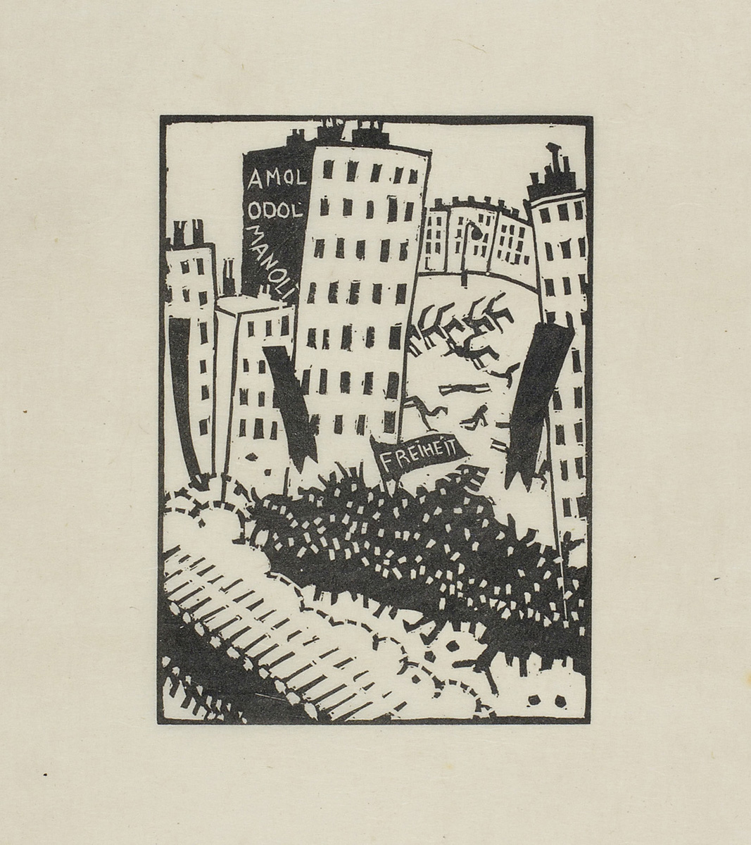
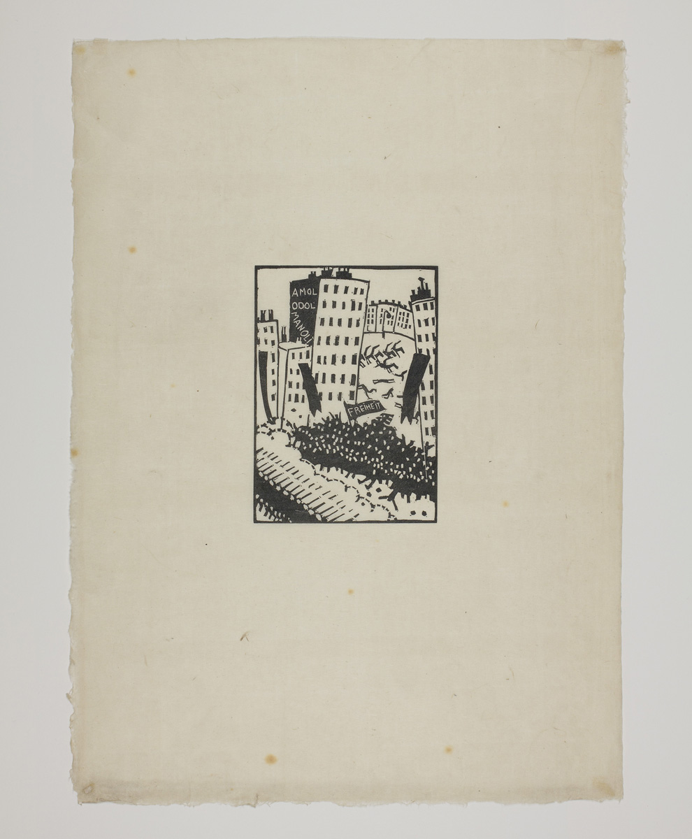
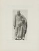
Hans Schmitz: Arbeiter 1921
Blatt 3 aus der Mappe „9 signierte Linolschnitte 1921-1927“, herausgegeben von der Galerie Werner Kunze, Berlin 1972. Exemplar 63/100. Die Mappe enthält neben einem Doppelblatt mit einem Einführungstext und der Fotografie einer Skulptur von Schmitz auf dem Frontispiz folgende signierte Blätter: 1. Porträt Seiwert (1924), 2. Arbeiterausbildung (1921), 3. Arbeiter (1921), 4. Arbeitergang (1922), 5. Die Masse (1923), 6. Arbeiterpaar (1923), 7. Arbeiterfreizeit (1924), 8. Sitzende (1927), 9. Gefallener (1927).
Worker 1921
Sheet 3 from the portfolio ‘9 signed linocuts 1921–1927’, published by Galerie Werner Kunze, Berlin 1972. Copy 63/100. Apart from a double-page spread with an introductory text and a photograph of a sculpture by Schmitz on the frontispiece, the portfolio contains the following signed sheets: 1. Portrait of Seiwert (1924), 2. Workers’ Training (1921), 3. Workers (1921), 4. Procession of Workers (1922), 5. The Masses (1923), 6. Working-Class Couple (1923), 7. Workers’ Leisure (1924), 8. Seated Figure (1927), 9. The Fallen (1927).
|
Mappe
komplett
1350
|
| |
       |
| |
        |
| |
|
|
|
W 2
|
Hans Schmitz: Arbeiterausbildung 1921
Blatt 2 aus der Mappe „9 signierte Linolschnitte 1921-1927“. Beschreibung siehe vorige Kat.nr.
Workers’ Education 1921
Sheet 2 from the portfolio ‘9 signed linocuts 1921–1927’. For a description, see the previous catalogue number.
|
|
| |
|
|
|
W 3
|
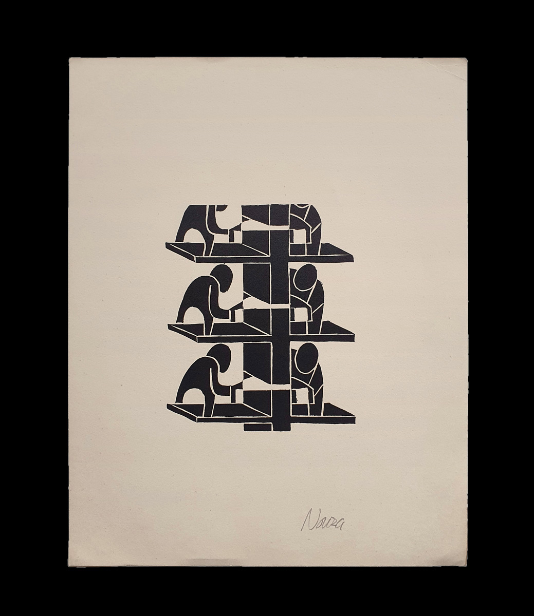
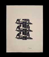
Oldřich Nouza: Pásová výroba (Fließbandarbeit) um 1930
Linolschnitt auf Velinpapier, ca. 12 x 10 cm(Platte), 27 x 21 cm (Blatt). Vom Künstler mit Bleistift signiert und verso mit der Nummer 788 bezeichnet.
Der tschechische Dichter, Fotograf, Pädagoge, Übersetzer, Lektor, Grafiker und Maler Oldřich Nouza war zusammen mit Josef Bartuška Gründer des Künstlerkollektivs „Kontakt“, das sich ab 1928 im Café Savoy in České Budějovice traf. Daran knüpfte 1930 der avantgardistische Künstlerverband „Linie“ an, der die gleichnamige Zeitschrift herausgab. Oldřich Nouza war zudem seit 1929 Mitglied der „Levá fronta“, die den Verband für moderne Kultur „Devětsil“ abgelöst hatte. Der Verband „Linie“ löste sich 1939 auf. In seinen piktogrammartigen Grafiken nimmt Nouza den typischen Stil der Kölner progressiven Künstler auf, der u.a. der Tscheche Augustin Tschinkel angehört hatte. Tschinkel kehrte 1931 nach Tschechien zurück und bekleidete in Prag für die nächsten 10 Jahre die Stelle des grafischen Beraters des Staatlichen Schulbücherverlages. Man muss davon ausgehen, dass Nouza Tschinkel kannte. (siehe auch Kat. Nr. W5)
Assembly-line work c. 1930
Linocut on wove paper, approx. 12 x 10 cm (plate), 27 x 21 cm (sheet). Signed in pencil by the artist and marked with the number 788 on the verso.
The Czech poet, photographer, teacher, translator, editor, graphic artist and painter Oldřich Nouza, with Josef Bartuška, founded the artists’ collective ‘Kontakt’, which met at Café Savoy in České Budějovice from 1928 onwards. This was followed in 1930 by the avant-garde artists’ association ‘Linie’, which published the magazine of the same name. Oldřich Nouza had also been a member of ‘Levá fronta’ since 1929, which had replaced the Association for Modern Culture ‘Devětsil’. The ‘Linie’ association disbanded in 1939. In his pictogram-like prints, Nouza adopts the characteristic style of the progressive artists in Cologne, a group to which, amongst others, the Czech artist Augustin Tschinkel had belonged. Tschinkel returned to the Czech Republic in 1931 and held the post of graphic consultant to the State School Book Publishing House in Prague for the next ten years. It must be assumed that Nouza knew Tschinkel. (see also Cat. No. W5)
|
150
|
| |
 |
|
| |
|
|
|
W 4
|
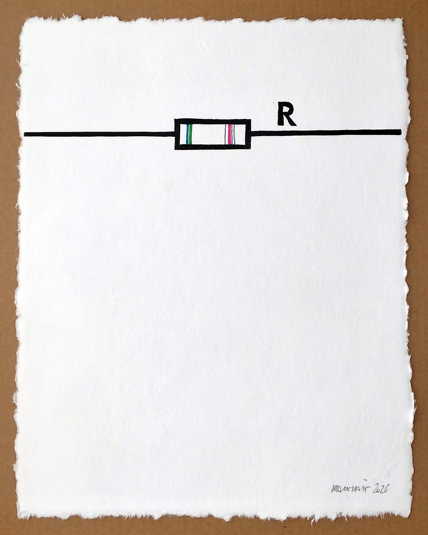
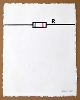
Roland Maurmair: Resistance (Widerstand) 2026
Hochdruck, individuell koloriert auf handgeschöpftem Papier, 40 x 31 cm (Blatt). Eines von 15 Exemplaren als Begleitgrafik zur Vorzugsausgabe des Buches: Roland Maurmair: Einen Dreck muss ich!, Verlag Schlebrügge, Frankenmarkt / Wien 2026
Resistance 2026
Relief print, individually coloured on handmade paper, 40 x 31 cm (sheet). One of 15 copies accompanying the special edition of the book: Roland Maurmair: Einen Dreck muss ich! Schlebrügge Publishers, Frankenmarkt / Vienna 2026
|
220
|
| |
 |
|
| |
|
|
|
W 5
|
Augustin Tschinkel: Vollstrecker 1928
Linolschnitt auf Büttenpapier, 12,7 x 8 cm (Platte), 43,8 x 32,5 cm (Blatt). Signiert „aug. tschinkel“. Herausgegeben von der Galerie Werner Kunze, Berlin 1972. Referenz: Galerie Brockstedt 1975, Tschinkel ff. (mit Abb.)
The Executioner 1928
Linocut on laid paper, 12.7 x 8 cm (plate), 43.8 x 32.5 cm (sheet). Signed ‘aug. tschinkel’. Published by Galerie Werner Kunze, Berlin 1972. Reference: Galerie Brockstedt 1975, Tschinkel ff. (with ill.)
|
600
|
| |
 |
|
| |
|
|
|
W 6
|
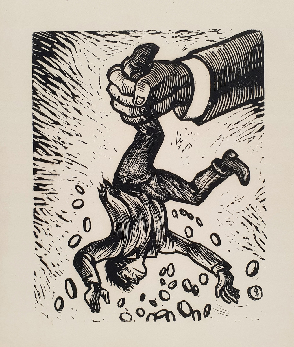
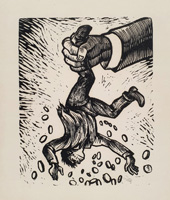
Alberto Beltrán: Ausgeschüttelt 1984
Holzschnitt auf dünnem Velinpapier, 20 x 15 cm (Stock), 29,7 x 21,1 cm (Blatt). Siehe auch Kat. Nr. V9
Shaken Out 1984
Woodcut on thin wove paper, 20 x 15 cm (block), 29.7 x 21.1 cm (sheet). See also Cat. No. V9
|
150
|
| |
 |
|
| |
|
|
|
W 7
|
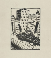
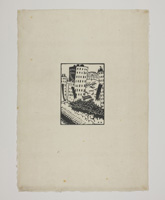
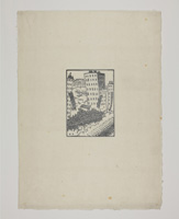
Richard Seewald: Revolution 1913
Holzschnitt auf Japanbütten mit Schöpfrand, 14 x 10 cm (Stock), ca. 42 x 30 cm (Blatt). Blatt 1 aus dem Mappenwerk "Zehn Holzschnitte", veröffentlicht im Heinrich F.S. Bachmair Verlag, München 1913. Eines von 100 Exemplaren (neben 10 signierten Exemplaren der Vorzugsausgabe). Der Holzschnitt diente auch als titelgebende Illustration des ersten Heftes der Zeitschrift "Revolution", die im selben Verlag erschien. Referenz: Jentsch (Seewald) H10; Jentsch (Expressionismus) 11; The Robert Gore Rifkind Center M.82.288.287a
Revolution 1913
Woodcut on Japanese laid paper with deckle edge, 14 x 10 cm (block), c. 42 x 30 cm (sheet). Plate 1 from the portfolio ‘Zehn Holzschnitte’, published by Heinrich F.S. Bachmair Verlag, Munich 1913. One of 100 impressions (apart from 10 signed impressions of the special edition). The woodcut also served as the title illustration for the first issue of the magazine ‘Revolution’, which was published by the same publisher. Reference: Jentsch (Seewald) H10; Jentsch (Expressionism) 11; The Robert Gore Rifkind Center M.82.288.287a
|
|
| |
   |
|
| |
|
|
|
W 8
|
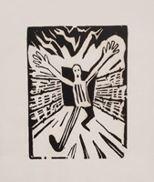
Hebert Sandberg: Endlich 1948
Holzschnitt auf dünnem Velinpapier, 12 x 9 cm (Stock), 29,7 x 21,1 cm (Blatt). Druck einer späteren Auflage.
At Last 1948
Woodcut on thin wove paper, 12 x 9 cm (block), 29.7 x 21.1 cm (sheet). Print from a later edition.
|
150
|
| |
 |
|
| |
|
|
|
W 9
|
Felix Droese: Schlüssel im Holz 1995
Holzschnitt auf Büttenpapier mit Wasserzeichen "Hanf", 27 x 36 cm (Stock), 40 x 46 cm (Blatt). Mit Bleistift signiert und datiert. Hrsg. von der Griffelkunst-Vereinigung, Hamburg, Editionsverzeichnis 280 A 6, 1995.
Key in Wood 1995
Woodcut on laid paper with watermark "Hemp", 27 x 36 cm (block), 40 x 46 cm (sheet). Signed and dated in pencil. Published by the Griffelkunst-Vereinigung, Hamburg, Editionsverzeichnis 280 A 6, 1995.
|
450
|
| |
 |
|
| |
|
|
|
W 10
|
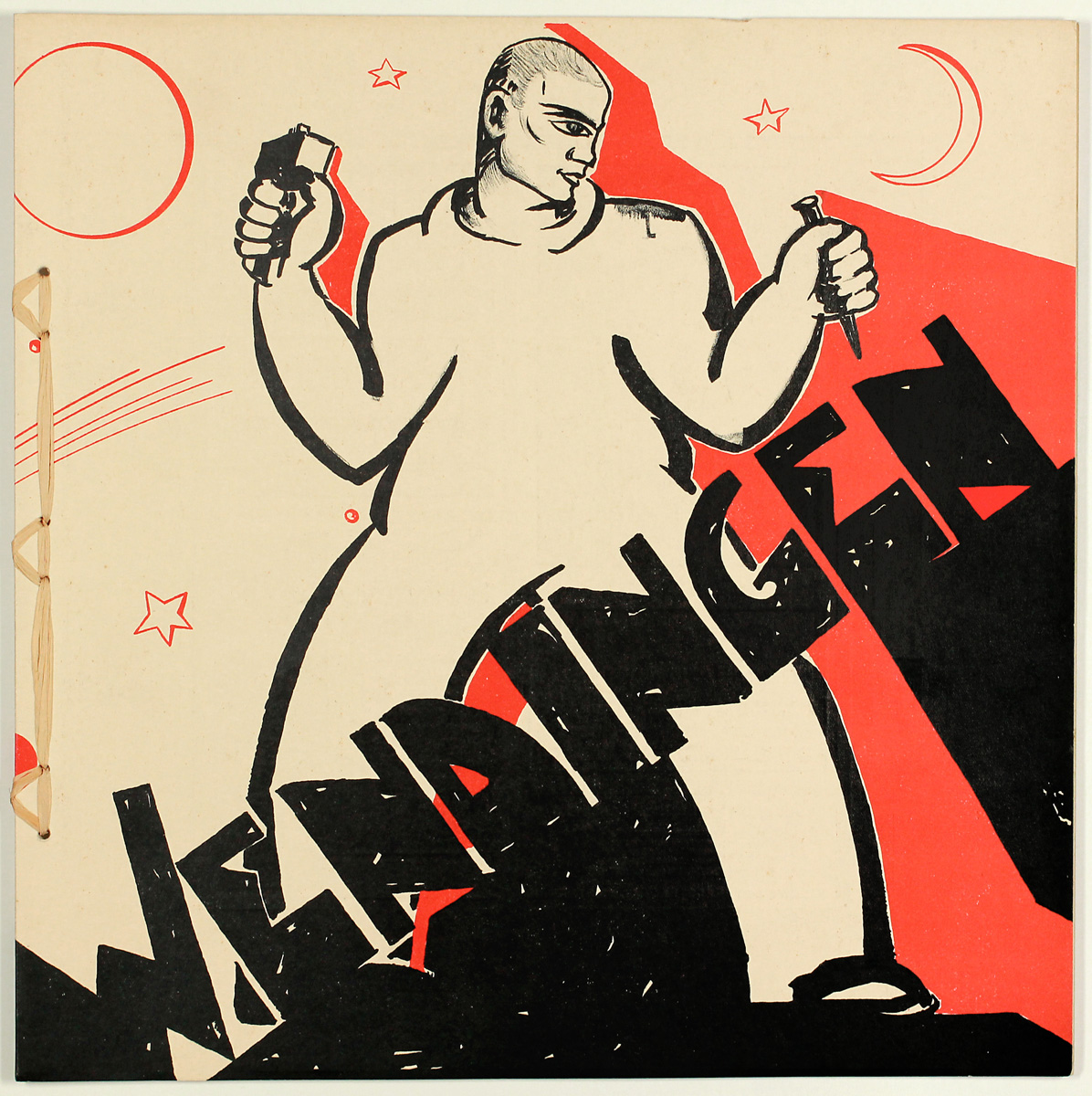
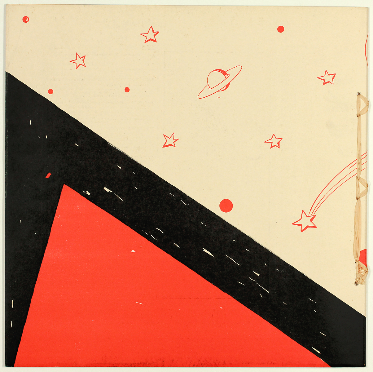
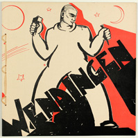
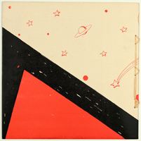
Hildo Krop: Mann mit Hammer und Meißel (Wendingen 12-5) 1931
Zeitschrift Wendingen, 12. Jg., Nr. 5, 1931. Umschlag recto und verso mit einer Farblithografie nach einem Entwurf von Hildo Krop. Einleitung von A. M. Hammacher. Mit 27 Abbildungen von Büsten und anderen Skulpturen des Amsterdamer Stadtbildhauers Hildo Krop. Referenz: Le Coultre 2001, S. 254 f.
Man with Hammer and Chisel (Wendingen 12-5) 1931
Wendingen magazine, Vol. 12, No. 5, 1931. Recto and verso covers feature a colour lithograph based on a draft by Hildo Krop. Introduction by A. M. Hammacher. With 27 illustrations of busts and other sculptures by the Amsterdam municipal sculptor Hildo Krop. Reference: Le Coultre 2001, pp. 254 ff.
|
300
|
| |
  |
|
| |
|
|
|
W 11
|
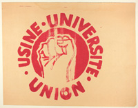
Atelier Populaire: Usine Université Union (Fabrik Universität Zusammenhalt) 1968
Siebdruck auf Plakatpapier, 38 x 49 cm (Blatt). Atelier Populaire de l' École des Beaux Arts, Paris 1968. Probedruck.
Eines von bisher 634 nachgewiesenen Motiven für Kleinplakate, die von Studenten der Pariser Kunstakademie im Schnellverfahren als Handsiebdruck zur Unterstützung der revoltierenden Studentenschaft im Mai 1968 gedruckt wurden. Dieses Exemplar lässt an Aussagekraft (Fabrik Universität Zusammenhalt), unterstützt durch die Eindringlichkeit der Alliteration im Französischen und die symbolträchtige erhobene Faust, aber auch durch den verwischten Druck, dem man die Hastigkeit des Produktionsprozesses ansieht, nichts an Authentizität zu wünschen übrig. Es stammt aus dem Privatbesitz eines Holländers, der als Studentenvertreter selbst an den Unruhen teilnahm und überzählige bzw. unzureichend gedruckte Exemplare persönlich einsammelte.
Factory University Unity 1968
Screen print on poster paper, 38 x 49 cm (sheet). Atelier Populaire de l’École des Beaux-Arts, Paris 1968. Trial proof.
One of 634 designs documented to date for small posters, which were printed by students at the Paris School of Fine Arts using a rapid screen-printing process to support the rebelling student body in May 1968. This copy leaves nothing to be desired in terms of authenticity, thanks to the power of its message (‘Factory, University, Unity’), reinforced by the forcefulness of the alliteration in French and the symbolic raised fist, as well as the blurred print, which reveals the haste with which it was produced. It comes from the private collection of a Dutchman who, as a student representative, took part in the unrest himself and personally collected surplus or poorly printed copies.
|
500
|
| |
 |
|
| |
|
|
|
W 12
|
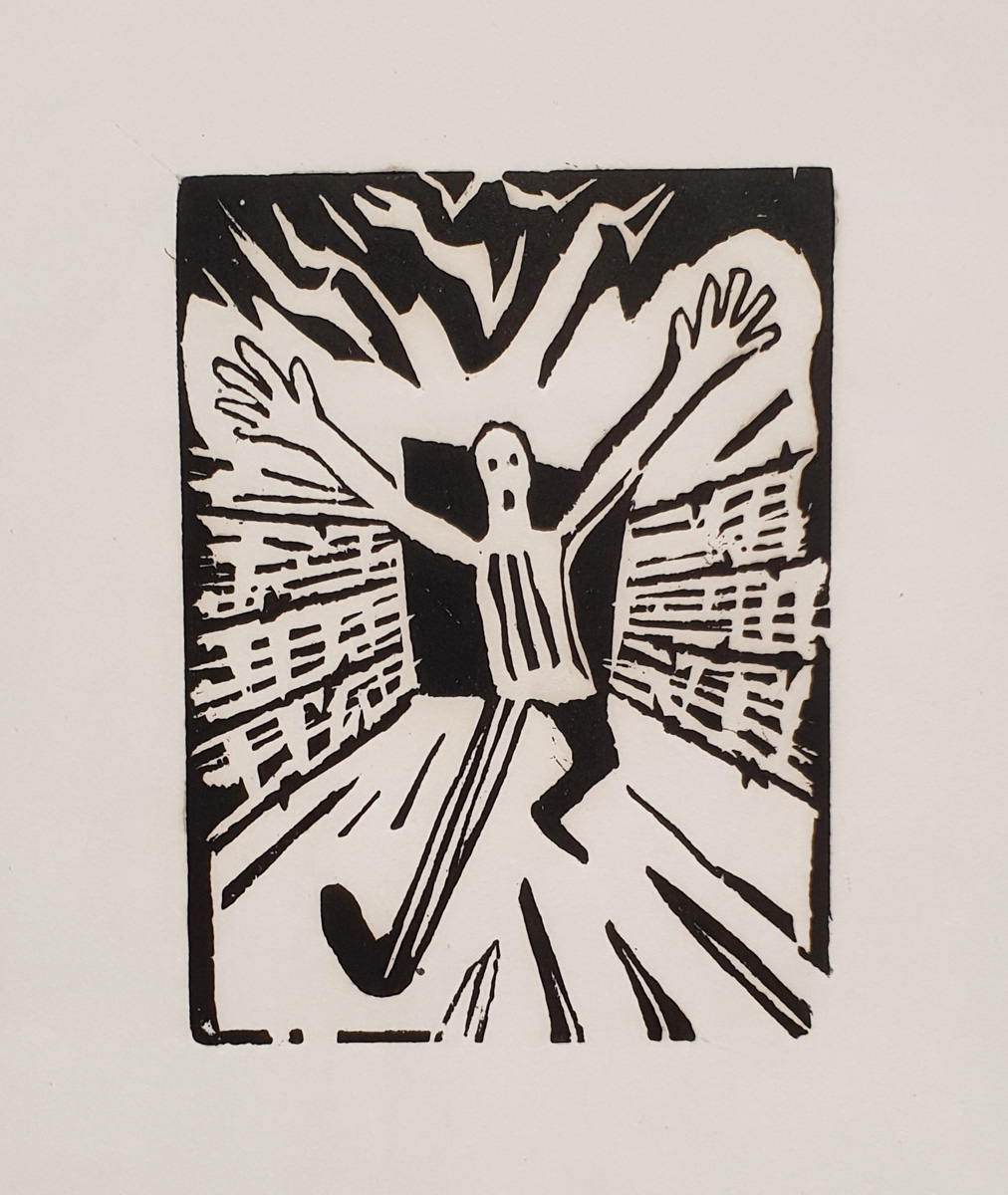
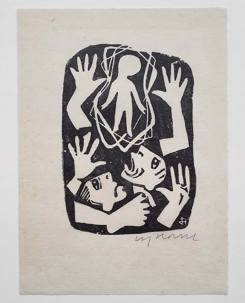
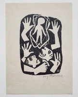
Carry Hauser: Welt (Angst) 1976
Linolschnitt auf Japanpapier, ca. 14,8 x 10,3 cm (Platte), 22,2 x 16,4 cm (Blatt). Vom Künstler mit Bleistift signiert. Provenienz: Ex Sammlung Erich Fitzbauer. Referenz: Cabuk 1976 D 2
World (Fear) 1976
Linocut on Japan paper, approx. 14.8 x 10.3 cm (plate), 22.2 x 16.4 cm (sheet). Signed in pencil by the artist. Provenance: formerly in the collection of Erich Fitzbauer. Reference: Cabuk 1976 D 2
|
250
|
| |
 |
|
| |
|
|
|
W 13
|
Klaus Staeck: coca-cola-day (Konsumgedenktage 68) 1968
Farbholzschnitt und Buchdruck auf Velinpapier, am Oberrand auf Karton mit gedrucktem Kalendarium montiert, 41,3 x 29,3 cm (Karton).
Kalender für 1968 mit 13 Originalgrafiken (Farbholzschnitt, Siebdruck, Collage). Je eine Grafik für jeden Monat sowie ein Titelblatt. Eines von 500 im Impressum vom Künstler signierten Exemplaren. Die Titel für die 12 Monate sind: 1. ampel-tag 2. tag der kleinaktien 3. coca-cola-day 4. tag der unbekannten rabattmarke 5. conserven-tag 6. computer-tag 7. test-tag 8. packdentiger-tag 9. blutundbild-tag 10. television-tag 11. sperrmüll-tag 12. servus-werbe-tag
Am Höhepunkt der weltweiten Proteste gegen den Vietnamkrieg erinnert Staeck an die Verbindung zwischen Wirtschaft und Politik, im Falle des Märzbildes symbolisiert durch den Coca-Cola-Schriftzug, die amerikanischen Sterne und ein junges Vietnamopfer.
coca-cola-day (Consumer Commemoration Days 68) 1968
Color woodcut and letterpress print on wove paper, mounted at the top margin on cardboard with a printed calendar, 41.3 x 29.3 cm (cardboard). Calendar for 1968 with 13 original prints (color woodcut, screen print, collage). One print for each month, together with a title page. One of 500 copies signed by the artist in the colophon. The titles for the 12 months are: 1. traffic light day 2. small-share day 3. coca-cola day 4. day of the unknown discount voucher 5. tinned food day 6. computer day 7. test day 8. packdentiger day 9. blood-and-image day 10. television day 11. bulky waste day 12. servus advertising day
At the height of the global protests against the Vietnam War, Staeck draws attention to the link between business and politics, symbolised in the March image by the Coca-Cola logo, the American stars and a young victim of the Vietnam War.
|
Kalender komplett 600
|
| |
 |
|
| |
|
|
|
W 14
|
C. A. Lion Cachet: Marionetten (Wendingen 4-7/8) 1921
Holzschnitt auf Karton, 31,5 x 29,5 cm. Vorderseite des Umschlages der Zeitschrift Wendingen, 4. Jg., Nr. 7/8, 1921. Das Thema des Heftes waren Marionetten aus China, Japan, Java und Nordafrika im Vergleich mit zeitgenössischen Marionetten von Sophie Taeuber, Otto Morach und Richard Teschner. So schuf der Künstler Lion Cachet das Monogramm von Wendigen in Marionettenform, wobei die beiden Seiten des Buchstaben auf der Rückseite des Umschlages vertikal gespiegelt wurden, die Figuren sich also ansehen (auch in der Galerie erhältlich).
Puppets (Wendingen 4-7/8) 1921
Woodcut on cardboard, 31.5 x 29.5 cm. Front cover of the journal 'Wendingen', vol. 4, no. 7/8, 1921. The theme of the issue was marionettes from China, Japan, Java, and North Africa, compared with contemporary puppets by Sophie Taeuber, Otto Morach and Richard Teschner. The artist Lion Cachet created the Wendingen monogram in the form of a marionette, with the two sides of the letter mirrored vertically on the back of the cover, so that the figures are facing each other (also available in the gallery).
|
60
|
| |
 |
|
| |
|
|
|
W 15
|
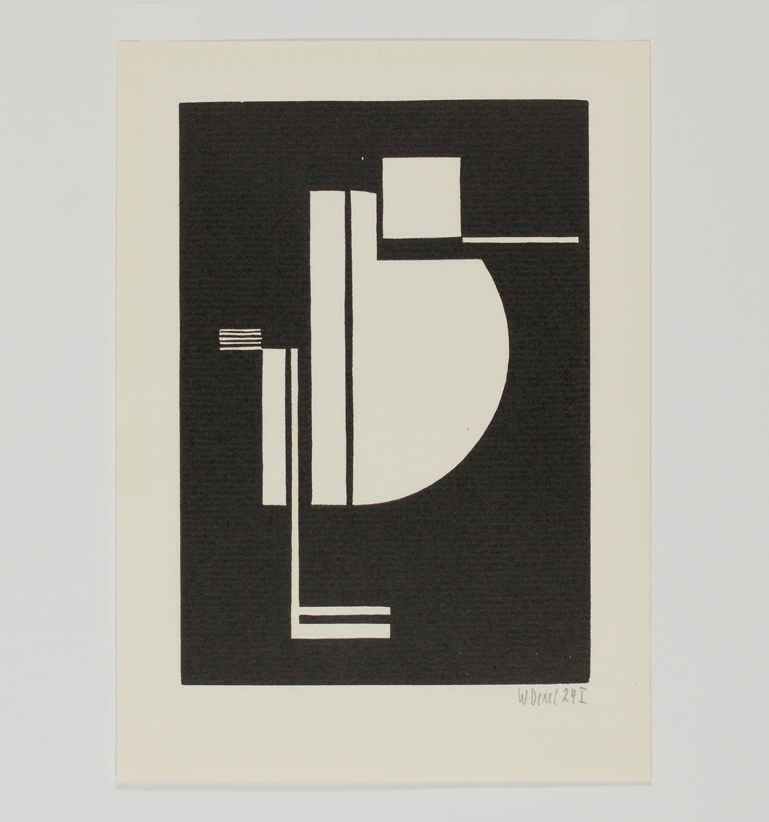
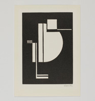
Walter Dexel: 24 I 1924
Holzschnitt auf Büttenpapier, 17 × 13,8 cm (Stock), 21,5 x 15,5 cm (Blatt). Signiert und datiert „24 I“. Neudruck aus „La Lune en Rondage III“, hrsg. von Carl Laszlo, Edition Panderma, Basel 1977. Eines von 65 nicht nummerierten, signierten Künstlerexemplaren aus einer Gesamtauflage von 230.
Von Dexel gibt es neben dem Holzschnitt 24 I noch einen zweiten, annähernd gleichformatigen Holzschnitt aus 1924, datiert und nummeriert „24 II“. Während dieser zweite Holzschnitt kaum noch figurativ gedeutet werden kann, dürfte es beim vorliegenden Motiv für den Betrachter relativ einfach sein, einen stehenden Vogel zu erblicken. Ganz nach der vom surrealistischen Filmregisseur Luis Buñuel geschilderten Erfahrung, er hätte keine Handlung so absurd anlegen können, dass die Zuschauer nicht doch noch einen Sinn darin erblickt hätten, was die interessante Frage aufwirft, ob es so etwas wie absolute Abstraktion überhaupt gibt.
24 I 1924
Woodcut on laid paper, 17 × 13.8 cm (block)), 21.5 x 15.5 cm (sheet). Signed and dated ‘24 I’. Reprint from ‘La Lune en Rondage III’, edited by Carl Laszlo, Edition Panderma, Basel 1977. One of 65 unnumbered, signed artist's proofs from a total edition of 230.
Apart from the woodcut 24 I, there is a second woodcut by Dexel from 1924, of approximately the same size, dated and numbered ‘24 II’. Whilst this second woodcut can hardly be interpreted as figurative, it should be relatively easy for the viewer to recognise a standing bird in the motif before us. Just as the Surrealist film director Luis Buñuel once remarked, he could not have devised a plot so absurd that the audience would not have found some meaning in it after all – which raises the interesting question of whether such a thing as absolute abstraction even exists.
|
750
|
| |
 |
|
| |
|
|
|
W 16
|
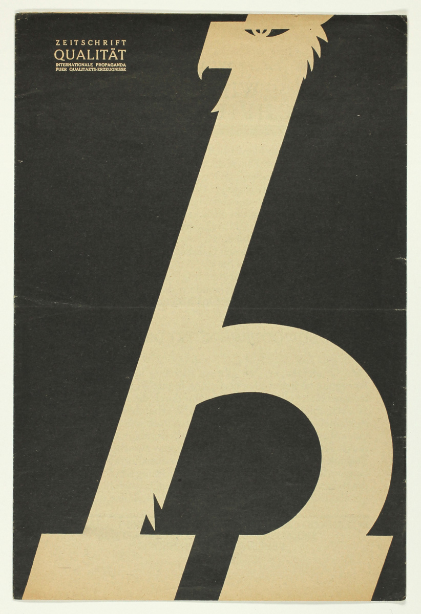
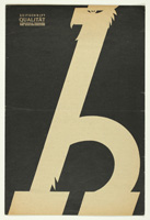
Carl Ernst Hinkefuß: Zeitschrift Qualität ab 1920
Lithographie auf einfachem Papier. Aus einem Konvolut mit 30 Werbezetteln u.a. für:
Zeitschrift Qualität, Der Arbeiter-Fotograf, Die Linse, Büchergilde Gutenberg, Der wahre Jakob,
Der Bücherkreis, Die Schaffenden, Die illustrierte Monatsschrift W.O.K.S., Phöbus-Verlag, Fritz Rosenfeld „Tirilin reist um die Welt“, El Libro Negro, Neuer Deutscher Verlag, Jüdische Revue, Magnus Hirschfeld „Sittengeschichte der jüngsten Zeit“.
Ab 1920 gab Carl Ernst Hinkefuß die Zeitschrift „Qualität – Zeitschrift für wirtschaftliche Bildung und Qualitätsproduktion“ heraus, die bis 1933 erschien. Das Blatt orientierte sich an den ästhetischen Kriterien des Werkbundes und ab 1925 verstärkt am Bauhaus. Ab 1926 wurde es von der Hofbuchdruckerei C. Dünnhaupt in Dessau gedruckt, die unter anderem ab 1926 auch die Zeitschrift „Bauhaus“ druckte.
‘Qualität’ magazine from 1920
Lithograph on plain paper. In a collection of 30 advertising leaflets, with those for:
‘Qualität’ magazine, ‘Der Arbeiter-Fotograf’, ‘Die Linse’, Büchergilde Gutenberg, ‘Der wahre Jakob’,‘Der Bücherkreis’, ‘Die Schaffenden’, ‘Die illustrierte Monatsschrift W.O.K.S.’, Phöbus-Verlag, Fritz Rosenfeld’s ‘Tirilin reist um die Welt, ‘El Libro Negro’, ‘Neuer Deutscher Verlag’, ‘Jüdische Revue’, Magnus Hirschfeld’s ‘Sittengeschichte der jüngsten Zeit’.
From 1920, Carl Ernst Hinkefuß published the magazine ‘Qualität – Zeitschrift für wirtschaftliche Bildung und Qualitätsproduktion’ (Quality – Journal of Economic Education and Quality Production), which was published until 1933. The magazine was guided by the aesthetic criteria of the Werkbund and, from 1925 onwards, increasingly by those of the Bauhaus. From 1926, it was printed by the Hofbuchdruckerei C. Dünnhaupt in Dessau, which, amongst other things, also printed the magazine ‘Bauhaus’ from 1926 onwards.
|
Konvolut
450
|
| |
 |
|
| |
|
|
|
W 17
|
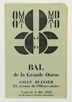
Mikhail Feodorovich Larionov (Fernand Léger?): Bal de la Grande Ourse 1925
Holzschnitt und Buchdruck auf einfachem, grünlich-grauem Papier (zweimal gefalzt). 49.5 x 32.5 cm (aufgefaltet). Einladungszettel und gleichzeitig Plakat zu einem Künstlerball der "Union des Artistes Russes" in Paris am 8. Mai 1925.
Das typografisch-konstruktivistische Design mit einer zentralen und einer um 90 Grad gedrehten 8 als Titel (bei zweifacher Falzung) wird Mikhail Larionov zugeschrieben, der schon für den ersten Ball der russischen Künstler in Paris "Bal Transmental" die Eintrittskarten entworfen hatte. Genauso gut käme aber als Entwerfer des Designs, das dann nur noch als Holzschnitt ausgeführt wurde, Fernand Léger in Frage, an dessen Schablonentechnik von "La fin du monde" der Entwurf erinnert. Léger war - laut einer auf dem Plakat ebenfalls ersichtlichen Personenliste - Teilnehmer, wenn nicht sogar Mitgestalter des Balles, wie vermutlich viele der anwesenden Künstler. Die auf dem Plakat verewigte Künstlerliste stellt im Übrigen ein Who’s Who der Pariser Kunstszene der zwanziger Jahre da. Sie ist so lang, dass sie hier unmöglich im Detail zitiert werden kann. Mit einer Strichätzung nach Henri Laurens als Kopfleiste im entfalteten Zustand. Dort wird auch das Thema des Balls erwähnt, und zwar "L'Architecture Constructiviste".
Ball of the Great Bear 1925
Woodcut and letterpress on plain, greenish-grey paper (folded twice). 49.5 x 32.5 cm (unfolded). An invitation and, at the same time, a poster for an artists’ ball organised by the ‘Union des Artistes Russes’ in Paris on 8 May 1925.
The typographic-constructivist design, with a central ‘8’ and another rotated by 90 degrees as the title (when folded in two), is attributed to Mikhail Larionov, who had already designed the admission tickets for the first ball of Russian artists in Paris, the ‘Bal Transmental’. However, Fernand Léger could just as easily be considered the designer of this work, which was subsequently executed as a woodcut; the draft is reminiscent of his stencil technique used in ‘La fin du monde’. According to a list of names also visible on the poster, Léger was a participant, if not a co-organiser, of the ball – as were presumably many of the artists in attendance. Incidentally, the list of artists featured on the poster represents a ‘Who’s Who’ of the Parisian art scene of the 1920s. It is so long that it is impossible to quote it in detail here. With a line etching by Henri Laurens as the header when unfolded. The theme of the ball is mentioned there, namely ‘L’Architecture Constructiviste’.
|
500
|
| |
 |
|
| |
|
|
|
W 18
|
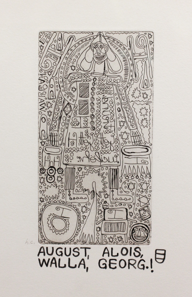
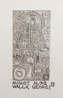
August Walla: Georg.! 1976
Radierung auf Velinpapier, 14,4 x 7,7 cm (Platte), 23,9 x 16,9 cm (Blatt). Vom Künstler mit Bleistift signiert und betitelt "AUGUST, ALOIS, WALLA, GEORG.!" sowie mit Wappen versehen. Von fremder Hand bezeichnet "h.c." (hors commerce).
Georg.! 1976
Etching on wove paper, 14.4 x 7.7 cm (plate), 23.9 x 16.9 cm (sheet). Signed and titled by the artist in pencil as 'AUGUST, ALOIS, WALLA, GEORG.!' together with a coat of arms. Marked 'h.c.' (hors commerce) by a second hand.
|
600
|
| |
 |
|
| |
|
|
|
Gstg 1
|
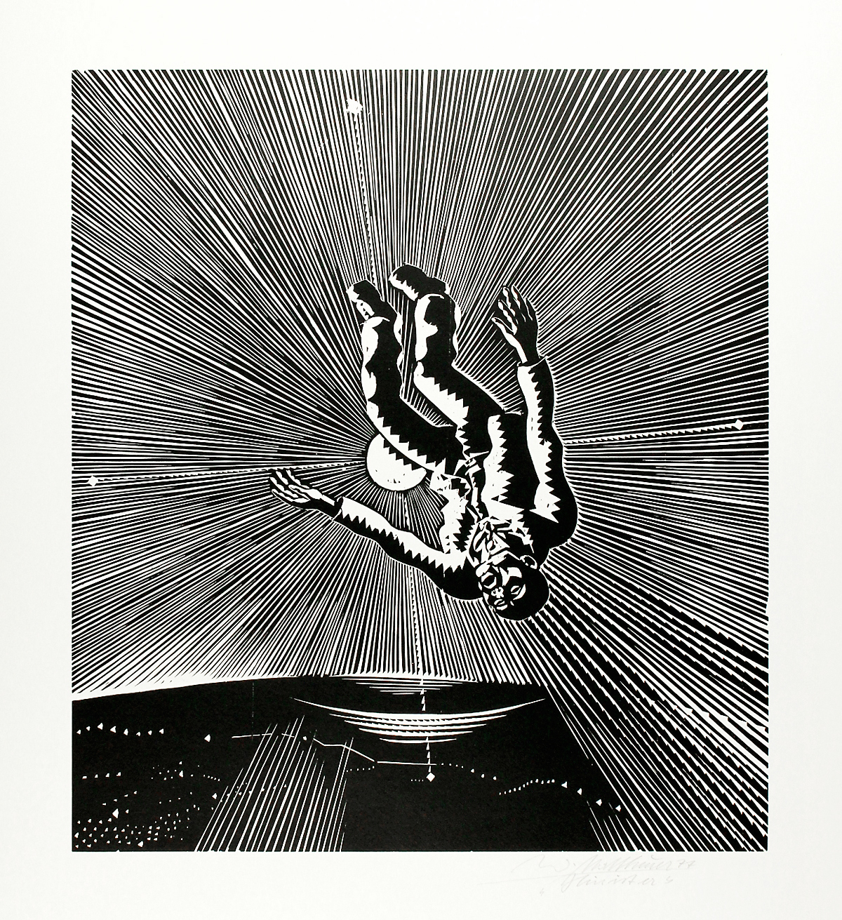
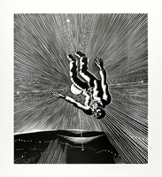
Wolfgang Mattheuer: Hin ist er 1977
Holzschnitt auf Büttenpapier, 49,2 x 43,9 cm (Stock), 76,3 x 64 cm (Blatt). Vom Künstler mit Bleistift signiert. Exemplar außerhalb der Auflage von 50 nummerierten Abzügen. Referenz: Koch 1987 Kat. 219; Koch 2010 Kat. 265
Wolfgang Mattheuer – Hauptvertreter der Leipziger Schule – beschäftigte sich ab den frühen siebziger Jahren mit dem Sisyphos-Thema (Die Flucht des Sisyphos, Sisyphos im Rad, Im Teufelskreis, Der übermütige Sisyphos, Sisyphos behaut den Stein). 1977 entstand der vorliegende Linolschnitt mit dem Bild eines kopfüber vom Himmel stürzenden Mannes, mit der strahlenden Sonne im Hintergrund und ab 1979 zahlreiche Darstellungen geflügelter Menschen im Flug sowie im und nach dem Absturz, wobei nur die aus dem Jahr des Zusammenbruchs der DDR stammende Bild "Ikarus erhebt sich" (1989) den Namen des tragischen antiken Protagonisten im Titel führt. Die versteckte Warnung in unserem Bild war wohl jedem DDR-Bürger unmittelbar verständlich: daß es gefährlich sei, sich in zu große Nähe der Macht zu begeben und der Fall mitunter schmerzlich. Sollte die Warnung am Ende für den Künstler Mattheuer selbst gegolten haben? Wusste doch gerade das langjährige SED-Mitglied Mattheuer (erst 1988 ausgetreten) offenbar sehr gut um die Gefahr und gleichzeitig, dieser durch Lavieren zwischen Nähe und Distanz zum Machtapparat sowie dem, was offen gesagt und dem, was man besser verklausulieren musste, zu begegnen.
He's gone 1977
Woodcut on wove paper, 49.2 x 43.9 cm (block), 76.3 x 64 cm (sheet). Signed in pencil by the artist. A copy apart from the edition of 50 numbered impressions. Reference: Koch 1987 Kat. 219; Koch 2010 Kat. 265
Wolfgang Mattheuer – a leading figure of the Leipzig School – explored the theme of Sisyphus from the early 1970s onwards (The Flight of Sisyphus, Sisyphus in the Wheel, In the Vicious Circle, The Exuberant Sisyphus, Sisyphus Carves the Stone). The present linocut, with a man plummeting headfirst from the sky against a backdrop of a radiant sun, was created in 1977; from 1979 onwards, the artist produced numerous depictions of winged figures in flight, together with images of people during and after their fall, although only the work ‘Icarus rises’ (1989) – dating from the year of the GDR’s collapse (1989) bearing the name of the tragic ancient protagonist in its title. The hidden warning in our image was probably immediately clear to every GDR citizen: that it is dangerous to get too close to power, and that the fall can sometimes be painful. Might the warning ultimately have applied to the artist Mattheuer himself? After all, Mattheuer – a long-standing member of the SED (only leaving the party in 1988) – was evidently well aware of the danger and, at the same time, knew how to counter it by manoeuvring between closeness to and distance from the apparatus of power, together with distinguishing between what could be said openly and what had to be couched in more cryptic terms.
|
1200
|
| |
 |
|
| |
|
|
|
Gstg 2
|
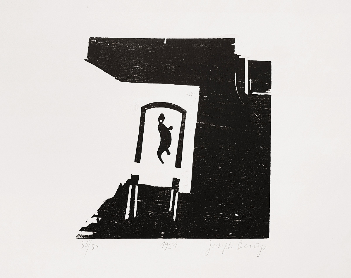
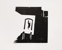
Joseph Beuys: Esse 1951
Holzschnitt auf sehr breitrandigem Velinpapier (BFK Rives), 26,8 x 25,5 cm (Stock), 50 x 64,8 cm (Blatt). Druck in schwarz (neben 50 in braun) der Auflage von 50 nummerierten und signierten Exemplaren von 1973. Handdruck von Joseph van der Grinten, heraussgegeben vom Propyläen Verlag Berlin. Referenz: Schellmann 94
Forge 1951
Woodcut on wide-margined wove paper (BFK Rives), 26.8 x 25.5 cm (block), 50 x 64.8 cm (sheet). Print in black (apart from 50 in brown) of the edition of 50 numbered and signed copies from 1973. Hand print by Joseph van der Grinten, published by Propyläen Verlag Berlin. Reference: Schellmann 94
|
2500
|
| |
 |
|
| |
|
|
|
Gstg 3
|
Joan Miró: Hommage à Aimé et Marguerite Maeght 1982
Farblithographie auf Velin-Karton, 37,9 x 55,7 cm. Aus dem Portfolio "Hommage à Aimé et Marguerite Maeght", das 1982 anlässlich des Todes des französischen Verlegerpaares Maeght von 24 der Verlagskünstler mit Originalgrafik ausgestattet wurde. Galerie Maeght, Paris 1982. Verso mit Text und der Bezeichnung "Miró, lithographie originale".
Hommage à Aimé et Marguerite Maeght 1982
Colour lithograph on wove card, 37.9 x 55.7 cm. From the portfolio “Hommage à Aimé et Marguerite Maeght”, which was compiled in 1982 on the occasion of the death of the French publishing couple Maeght, with original prints contributed by 24 of the publishing house’s artists. Galerie Maeght, Paris 1982. On the verso, with text and the inscription “Miró, lithographie originale”.
|
250
|
| |
  |
|
| |
|
|
|
W 19
|
Antonio Neto: Shadows of Anarchy 2016
Holzschnitt von einer Platte (Lindenholz) auf Japanpapier, 90 x 60 cm (Stock), 91 x 61 cm (Blatt). Nummeriert, betitelt, signiert und datiert. Eines von 5 Exemplaren.
Shadows of Anarchy 2016
Woodcut from a single plate (lime wood) on Japan paper, 90 x 60 cm (block), 91 x 61 cm (sheet). Numbered, titled, signed and dated. One of 5 copies.
|
700
|
| |
 |
|
| |
|
|
|
W 20
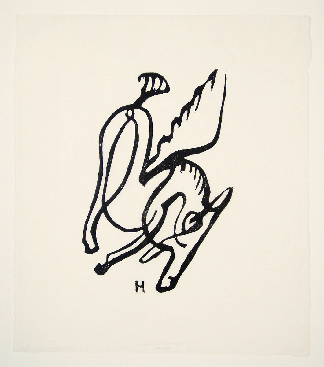
|
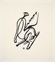
Raoul Hausmann: Ohne Titel (Pegasus) um 1950/1983
Holzschnitt auf Japanpapier, ca. 24,7 x 16,7 cm (Stock), 37 x 32 cm (Blatt). Verso mit dem Nachlass-Stempel am Blattunterrand. Druck der Griffelkunst-Vereinigung von 1983. Referenz: Rüggeberg I, 231 A1-5, Junge 1989, S. 451
Untitled (Pegasus) c. 1950/1983
Woodcut on Japan paper, approx. 24.7 x 16.7 cm (block), 37 x 32 cm (sheet). On the verso, with the estate stamp on the lower margin of the sheet. Printed by the Griffelkunst-Vereinigung in 1983. Reference: Rüggeberg I, 231 A1-5, Junge 1989, p. 451
|
300
|
| |
 |
|
| |
|
|
|
W 21
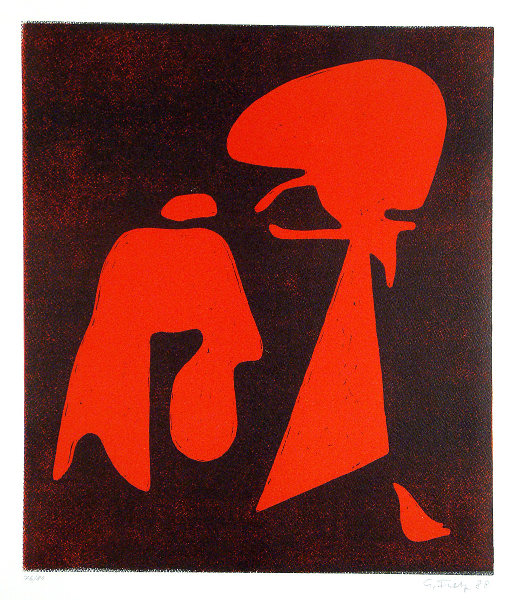
|
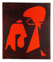
Gerhard Fietz: Zeichen 1988
Farbholzschnitt auf Velinpapier, 40,3 x 34,6 cm (Stock). 50 x 40 cm (Blatt). Nummeriert 76/80, signiert "G. Fietz" und datiert "88".
Sign 1988
Color woodcut on wove paper, 40.3 x 34.6 cm (block). 50 x 40 cm (sheet). Numbered 76/80, signed ‘G. Fietz’ and dated ‘88’.
|
650
|
| |
 |
|
| |
|
|
|
W 22
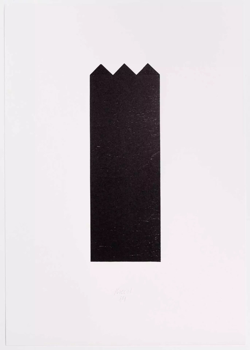
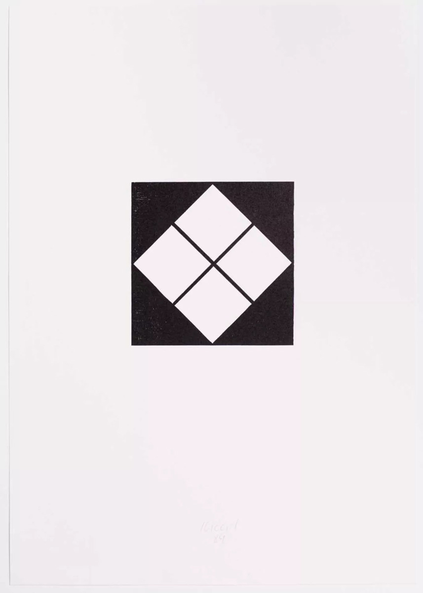
|
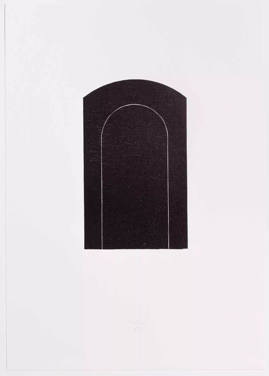
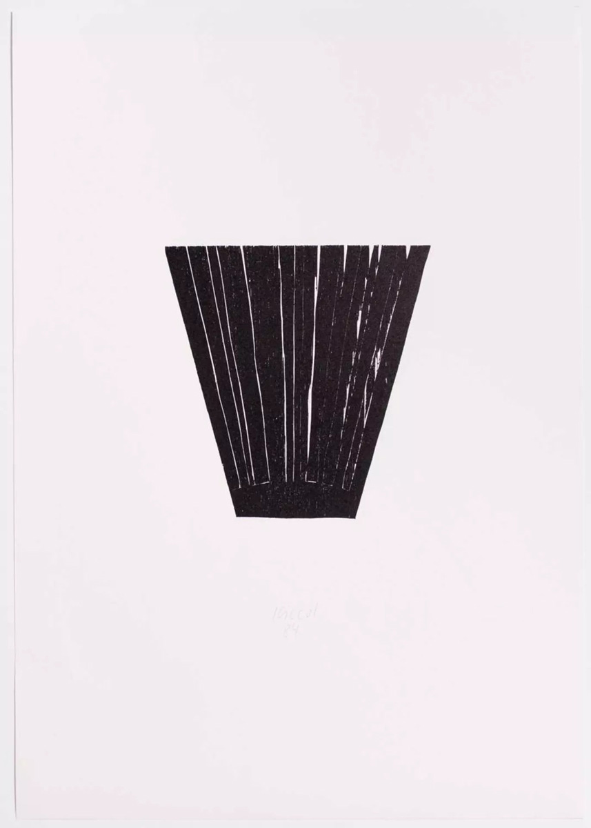
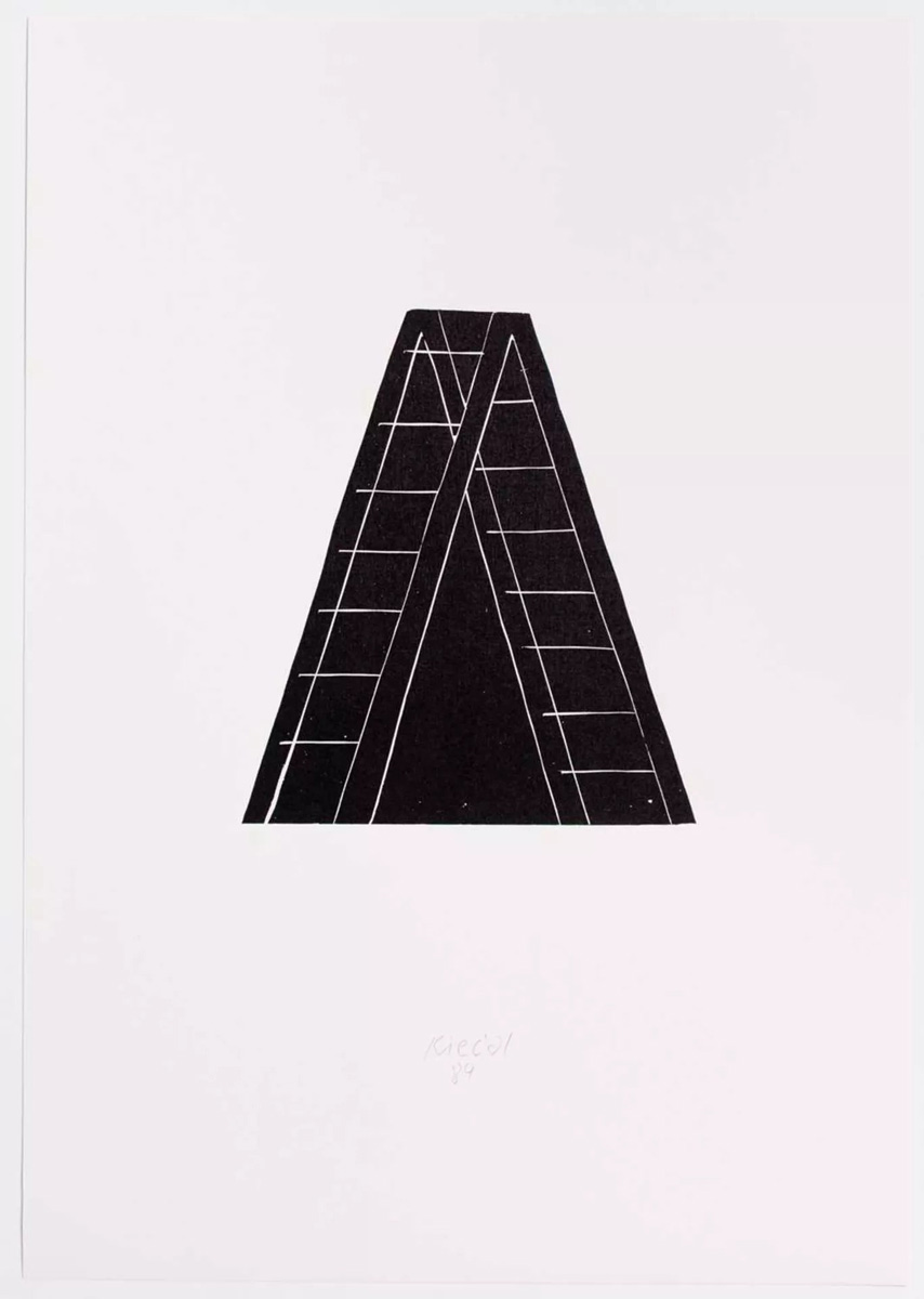
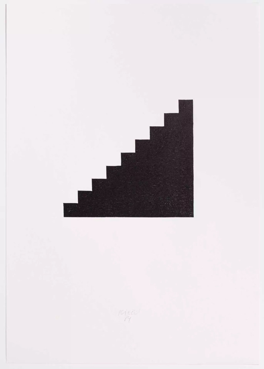
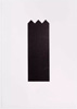
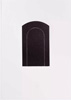
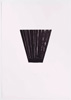
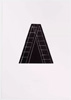
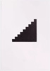
Hubert Kiecol: Sechs Holzschnitte 1984
Von links nach rechts : Zaun, Fenster, Tor, Busch, Leiter, Treppe. Je auf Büttenpapier, 50 x 35 cm (Blatt). Jeweils unterhalb der Darstellung mit Bleistift signiert und datiert: Kiecol / 84.
Six woodcuts 1984
From left to right: fence, window, gate, bush, ladder, stairs. Each on laid paper, 50 x 35 cm (sheet). Each signed and dated in pencil below the image: Kiecol / 84.
|
je 300
alle 1500
|
| |
      |
|
| |
|
|
|
W 23
|
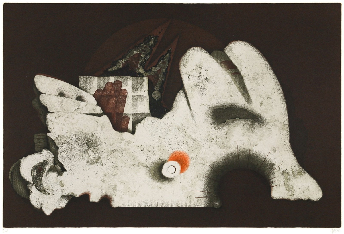
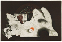
Heinrich Heuer: Flügel 1971
Farbradierung auf Büttenpapier, 40 x 60 cm (Platte), 54 x 77 cm (Blatt). Vom Künstler rechts unten signiert und mit E. A. (épreuve d'artiste) bezeichnet.Referenz: Online-Werkverzeichnis https://heinrichheuer.com/archiv/#5
So wie Paul Klee gab auch der erst 2023 verstorbene Meisterradierer Heinrich Heuer seinen nie gänzlich abstrakten aber stark zeichenhaften Formen immer symbolträchtige, mitunter auch sehr einfache und konkrete Titel wie „Buch“, „Köpfe“, „Porträt“ oder, wie im vorliegendem Fall, „Flügel“. Dies sollte uns aber nicht daran hindern, dem eigenen Assoziationsvermögen freien Lauf zu lassen. „Erkennbarkeiten im Bild“, schreibt Heinrich Heuer, „sind in diesem Sinne Zitate, keine Aussagen. Auch die Titel sind naheliegend-absichtslose Versuche, keine Anker und Angeln auszuwerfen, die Blickrichtungen festlegen.“
Wings 1971
Colour etching on laid paper, 40 x 60 cm (plate), 54 x 77 cm (sheet). Signed by the artist in the lower right corner and marked E. A. (épreive d'artiste). Reference: Online catalogue raisonné https://heinrichheuer.com/archiv/#5
Just like Paul Klee, the master etcher Heinrich Heuer – who passed away as recently as 2023 – liked to give his forms, which were never entirely abstract but rather symbolic, evocative titles that could sometimes be very simple and concrete, such as ‘Book’, ‘Heads’, ‘Portrait’ or, as in this instance, ‘Wings’. However, this should not prevent us from giving free rein to our own powers of association. ‘Recognisable elements in the picture,’ writes Heinrich Heuer, ‘are, in this sense, quotations, not statements. The titles, also, are obviously unintentional attempts; they are not anchors or hooks designed to fix the direction of the gaze.’
|
450
|
| |
 |
|
| |
|
|
|
V1
|
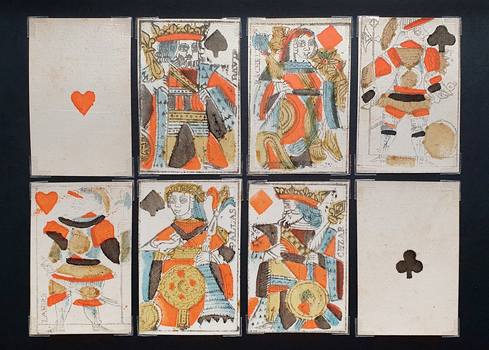
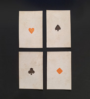
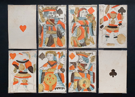
Anonym: Herz, Pik, Karo, Kreuz Ass (Portrait d’Auvergne)
Kartenspiel mit 32 Karten. Stempeldruck und Holzschnitt mit Schablonenkolorierung auf Büttenkarton, je 8,8 x 5,5 cm. Wasserzeichen Fleur de Lis. Clermont-Ferrand, vor 1791 oder nach 1814. Möglicherweise auch in der einzigen royalen, in Clermont-Ferrand nachweisbaren Manufaktur zwischen 1748 und 1752 hergestellt. Die aufgedruckte Ortsbezeichnung „Clermont (oder Clermond)“ befindet sich auf dem Kreuz-Buben. Referenz: Seguin 1968, S. 149 ff.
Anonymous: Aces of Hearts, Spades, Diamonds and Clubs (Portrait d’Auvergne)
A deck with 32 cards. Stamp printing and woodcut with stencil colouring on laid paper, each measuring 8.8 × 5.5 cm. Fleur-de-lis watermark. Clermont-Ferrand, before 1791 or after 1814. Possibly also made at the only royal workshop documented in Clermont-Ferrand between 1748 and 1752. The printed town name ‘Clermont (or Clermond)’ appears on the Jack of Clubs. Reference: Seguin 1968, p. 149 ff.
|
komplett
1200
|
| |
  |
|
| |
|
|
|
V2
|
Edward McKnight Kauffer: A-D 1941
An Intimate Journal for Art Directors, Production Managers, and their Associates. Vol. VIII, No. 2, New York 1941. 20 x 13,5 cm. 56 S. (nicht paginiert), 12 S. Werbeanzeigen. Einbandgestaltung recto und verso sowie Essay von Edward McKnight Kauffer, einem der einflussreichsten amerikanischen Print-Designer, der bereits im Jahre 1937 im MoMA in New York mit einer Einzelausstellung vertreten war. Hinten eingebunden: Design & Paper, Number 7. Issued by Marquardt & Company, Inc. – Fine Papers. 155 Spring Street, New York. 16 S. (nicht paginiert)
A-D 1941
An Intimate Journal for Art Directors, Production Managers, and their Associates. Vol. VIII, No. 2, New York 1941. 20 x 13.5 cm. 56 pp. (unpaginated), 12 pp. of advertisements. Cover design (recto and verso) and an essay by Edward McKnight Kauffer, one of the most influential American print designers, who had been featured as early as 1937 in a solo exhibition at MoMA in New York. Bound inside back cover: Design & Paper, Number 7. Published by Marquardt & Company, Inc. – Fine Papers. 155 Spring Street, New York. 16 pp. (unpaginated)
|
150
|
| |
  |
|
| |
|
|
|
V 3
|
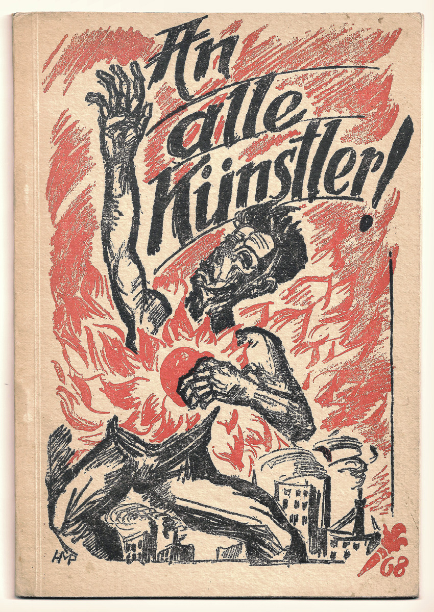
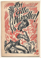
Max Pechstein: An alle Künstler! 1919
Hrsg. vom Werbedienst der deutschen Republik, gedruckt von der Kunstanstalt Willi Simon, Berlin 1919. 20 x 14 cm. 48 S. Farbige Umschlagzeichnung von Max Pechstein. Mit Textbeiträgen u.a. von Johannes R. Becher, Ludwig Meidner, Max Pechstein ("Was wir wollen") und Walter Hasenclever. Mit Abb. nach Grafiken u.a. von César Klein, Lyonel Feininger, Heinrich Richter-Berlin und Georg Tappert. Eines von vielen, aber vielleicht das berühmteste und eines der frühesten Manifeste aus dem Umkreis der Novembergruppe. Referenz: Raabe 137; Bolliger 2/69; Reed 368; Lang (Express. Buchill.) S. 46
To all the artists! 1919
Published by the Advertising Service of the German Republic, printed by Kunstanstalt Willi Simon, Berlin 1919. 20 x 14 cm. 48 pp. Coloured cover illustration by Max Pechstein. With texts by Johannes R. Becher, Ludwig Meidner, Max Pechstein (‘What We Want’) and Walter Hasenclever, among others. With illustrations based on graphics by César Klein, Lyonel Feininger, Heinrich Richter-Berlin and Georg Tappert, among others. One of many, but perhaps the most famous and one of the earliest manifestos from the November Group circle. Reference: Raabe 137; Bolliger 2/69; Reed 368; Lang (Express. Buchill.) p. 46
|
280
|
| |
 |
|
| |
|
|
|
V 4
|
(John Heartfield) Ilya Ehrenburg: A soviet writer looks at Vienna 1934
Illustrierte Or.-Broschur mit Klammerheftung. Titel unter Verwendung einer seltenen Fotomontage von John Heartfield. Verlag Martin Lawrence Limited, London 1934. 21 x 13,8 cm. 48 S. Übersetzung ins Englische von Ivor Montagu.
Ehrenburgs Büchlein ist ein Bericht über den Zustand der österreichischen Sozialdemokratie Ende der zwanziger Jahre, die Machtergreifung der Nazis in Deutschland und die Februarkämpfe 1934 in Wien. John Heartfields Umdeutung des gekreuzigten Jesus in den Tod eines x-beliebigen Mannes am und durch das Hakenkreuz ist wohl eines der stärksten antinazistischen Symbole, die die Zeit hervorgebracht hat.
A Soviet writer looks at Vienna 1934
llustrated original paperback with staple binding. Cover featuring a rare photomontage by John Heartfield. Published by Martin Lawrence Limited, London 1934. 21 x 13.8 cm. 48 pp. Translated into English by Ivor Montagu.
Ehrenburg’s booklet is an account of the condition of Austrian social democracy in the late 1920s, the Nazis’ seizure of power in Germany and the February Uprising of 1934 in Vienna. John Heartfield’s reinterpretation of the crucified Jesus as the death of an ordinary man on and by the swastika is probably one of the most powerful anti-Nazi symbols of that era.
|
200
|
| |
 |
|
| |
|
|
|
V 5
|
(Josef Čapek) Georges Duhamel : ZE ŽIVOTA MUČEDNÍKŮ (Aus dem Leben der Märtyrer) 1919
Verlag Alois Srdce, Prag 1919. 21 x 13 cm. 103 S. Tschechische Übersetzung aus dem Französischen von Růžena Říhová. Or.-Broschur mit einem Linolschnitt in rotbraun von Josef Čapek. Mit einem weiteren ganzseitigen Linolschnitt von Josef Čapek in Schwarz am Buchende. Referenz: Pomajzlová 12
Es handelt sich hier um einen der frühesten Bucheinbandentwürfe von Josef Čapek, der sich zeitlebens als Multitalent neben der Malerie, der freien Grafik, dem Bühnenbild, dem Film, der Publizistik und der Schriftstellerei intensiv der Buchgestaltung widmete. Alena Pomajzlová führt in ihrem Catalogue raisonné über 400 Einbandentwürfe an, von denen die meisten - so wie der vorliegende - von Čapek selbst als Linol- oder Farblinolschnitt ausgeführt wurden. Josef Čapek prägte zusammen mit seinem Bruder Karel maßgeblich das intellektuelle Leben der Tschechoslowakei in den 1920er und 1930er Jahren bevor er von den Nazis verschleppt und ermordet wurde. Ebenso standhaft wie seine Weigerung, nach dem deutschen Überfall die Tschechoslowakei zu verlassen, blieb sein Stil. Trotz verschiedener äußerer Einflüsse ist dieser immer unverwechselbar. Čapek war weniger vom Expressionismus als von Elementen der tschechischen Volkskunst und durch seine Pariser Studienjahre vom Kubismus beeinflusst. Bei aller Reduktion der Mittel kann sich auch Čapek nicht immer der expressiven Geste entziehen, z.B. wenn - wie im vorliegenden Fall - Duhamel das Elend von Menschen nacherzählt, die wegen ihrer Ideen oder Überzeugungen verfolgt wurden. Es ist, als hätte Čapek sein eigenes Schicksal vorausgeahnt.
The New Book of Martyrs (orig: Vie des Martyrs) 1919
Published by Alois Srdce, Prague 1919. 21 x 13 cm. 103 p. Czech translation from the French by Růžena Říhová. Original paperback with a linocut in red-brown by Josef Čapek. With another full-page linocut by Josef Čapek in black at the end of the book. Reference: Pomajzlová 12
This is one of the earliest book cover designs by Josef Čapek, a multi-talented artist who devoted himself intensively to book design throughout his life apart from painting, graphic design, stage design, film, journalism and writing. In her catalogue raisonné, Alena Pomajzlová lists over 400 cover designs, most of which - like this one - were executed by Čapek himself as linocuts or colour linocuts. Together with his brother Karel, Josef Čapek had a decisive influence on the intellectual life of Czechoslovakia in the 1920s and 1930s before he was abducted and murdered by the Nazis. His style remained as steadfast as his refusal to leave Czechoslovakia after the German invasion. Despite various external influences, it has always been unmistakable. Čapek was less influenced by Expressionism than by elements of Czech folk art and, through his years of study in Paris, by Cubism. Although the means are reduced, Čapek cannot always escape the expressive gesture, for example when - as in this case - Duhamel recounts the misery of people who were persecuted for their ideas or beliefs. It is as if Čapek had foreseen his own fate.
|
150
|
| |
   |
|
| |
|
|
|
V 6
|
(Vlastislav Hofman) Stanislav Lom: Kající Venuše (Die reuige Venus) 1927
Or.-Broschur mit Umschlaggestaltung von Vlastislav Hofman. Aventinum, Prag 1927. 21,5 x 13,8 cm. 88 S. Vlastislav Hofman war Architekt, Maler, Grafiker, Bühnenbildner, Kostümdesigner, Publizist und ein führendes Mitglied der tschechischen Avantgarde.
The Penitent Venus 1927
Original paperback with cover design by Vlastislav Hofman. Aventinum, Prague 1927. 21.5 x 13.8 cm. 88 pp. Vlastislav Hofman was an architect, painter, graphic artist, set designer, costume designer, publicist and a leading member of the Czech avant-garde.
|
50
|
| |
   |
|
| |
|
|
|
V 7
|
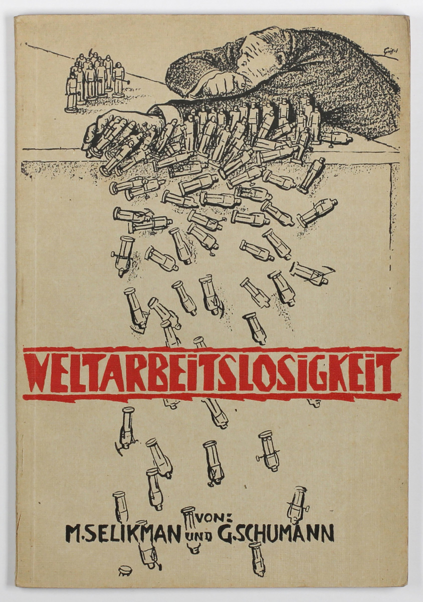
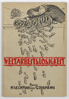
(Griffel= Lászlo Dállos) M. Selikman, Georg Schumann: Weltarbeitslosigkeit 1926
Or.-Broschur mit Umschlagillustration von "Griffel" (d.i. László Dállos). Verlag der Roten Gewerkschafts-Internationale, Moskau / Führer Verlag, Berlin 1926. 22,5 x 15,6 cm. Enthält die Aufsätze " Die Weltarbeitslosigkeit und ihre Perspektiven" und "Die internationale Arbeitslosigkeit und ihre Opfer". Dállos war Pressezeichner und Karikaturist. Er agierte in der ungarischen Räterepublik und lebte zwischen 1920 und 1927 in der deutschen Emigration, wo er für KPD-nahe Satireblätter arbeitete.
World Unemployment 1926
Original paperback with a cover illustration by 'Griffel' (i.e. László Dállos). Published by the Red Trade Union International, Moscow / Führer Verlag, Berlin, 1926. 22.5 x 15.6 cm. Contains the essays “World Unemployment and its Prospects” and “International Unemployment and its Victims”. Dállos was a press illustrator and caricaturist. He was active in the Hungarian Soviet Republic and lived in exile in Germany between 1920 and 1927, where he worked for satirical publications affiliated with the KPD.
|
|
| |
 |
|
| |
|
|
|
V 8
|
(Václav Mašek) Vladimir Majakovskij: 150.000.000 1925
V. Petr (Edice Atom), Prag 1925. 21,3 x 15,4 cm. 118 S. Erste Ausgabe auf Tschechisch (Übersetzung Bohumil Mathesius) des Revolutions-Poems von Vladimir Majakovskij. Illustrierte Or.-Broschur mit zweifarbigen Linolschnitten recto und verso von Václav Mašek. Mit 7 ganzseitigen Zinkhochätzungen nach Zeichnungen von Václav Mašek. Die Typographie folgt teilweise dem futuristischen Muster à la Marinetti ("Les mots en liberté futuristes" von 1919), eine Praxis, die auch Majakovskij übernahm. Die russische Originalfassung des berühmten Gedichtes erschien 1921.
150,000,000 1925
V. Petr (Edice Atom), Prague 1925. 21.3 x 15.4 cm. 118 pp. First Czech edition (translated by Bohumil Mathesius) of Vladimir Mayakovsky's revolutionary poem. Illustrated original paperback with two-colour linocuts on both recto and verso by Václav Mašek. With 7 full-page zinc etchings based on drawings by Václav Mašek. The typography partly follows the Futurist style à la Marinetti ('Les mots en liberté futuristes' from 1919), a practice which Mayakovsky adopted. The original Russian version of the famous poem was published in 1921.
|
300
|
| |
 |
|
| |
       |
|
| |
       |
|
| |
|
|
|
V 9
|
Widmungsexemplar - (Alberto Beltrán, Leopoldo Méndez) Pablo Neruda: At procitne dřevorubec (Holzfäller erwachet!) 1950
Hrsg. vom tschechoslowakischen Schriftstellerverband (Svaz československých spisovatelů), Prag 1950. 48 S. 24,2 x 19,5 cm. Or.-Broschur mit Holzschnittillustration, Titelholzschnitt und 6 Holzschnitt-Vignetten im Text von Alberto Beltrán. Die Broschüre erschien anlässlich des 1950 in Prag stattfindenden 2. Kongresses des Weltausschusses der Friedenskämpfer. Von Pablo Neruda auf dem Schmutztitel gewidmet, signiert und datiert. Nachwort von Jorge Amado. Der mexikanische "Taller de Gráfica Popular"-Künstler Alberto Beltrán hatte schon die mexikanische Originalausgabe von Nerudas Gedicht "Que despierte el leñador" illustriert. Die beiden Vorsatzblätter vorne und hinten sind verkleinerte Reproduktionen nach dem berühmten Holzschnitt "Fusilamiento" von Leopoldo Méndez, den dieser ursprünglich für den Vor- und Nachspann des Films "Un Día de Vida" 1950 geschaffen hatte.
Dedication copy – Pablo Neruda: Awake, Woodcutter! 1950
Published by the Czechoslovak Writers' Union (Svaz československých spisovatelů), Prague 1950. 48 pp. 24.2 x 19.5 cm. Original paperback with woodcut illustrations, a woodcut title page and 6 woodcut vignettes in the text by Alberto Beltrán. The brochure was published to mark the 2nd Congress of the World Committee of Peace Fighters, held in Prague in 1950. Dedicated, signed and dated by Pablo Neruda on the half-title page. Afterword by Jorge Amado. The Mexican 'Taller de Gráfica Popular' artist Alberto Beltrán had previously illustrated the original Mexican edition of Neruda's poem 'Que despierte el leñador'. The two endpapers at the front and back are reduced-size reproductions based on the famous woodcut 'Fusilamiento' by Leopoldo Méndez, which he had originally created for the opening and closing credits of the 1950 film 'Un Día de Vida'.
|
280
|
| |
   |
| |
      |
| |
      |
| |
|
|
|
V 10
|
Josef Váchal: Maske (Kniha Jiřiny Sahulové) 1926
Ex Libris für Jiřina Sahulová. Holzschnitt auf rotviolettem Velinpapier, 5,2 x 5,5 cm (Stock), 15 x 10,2 cm (Blatt). Vom Künstler mit Tinte signiert. Verso mit Bleistift nummeriert "5". Referenz: Hruška 2026, S. 202 f.
Mask (Bookplate for Jiřina Sahulová) 1926
Woodcut on reddish-purple wove paper, 5.2 x 5.5 cm (block), 15 x 10.2 cm (sheet). Signed with ink by the artist. Numbered "5" in pencil on the verso. Reference: Hruška 2026, S. 202 f.
|
70
|
| |
  |
|
| |
|
|
|
V 11
|
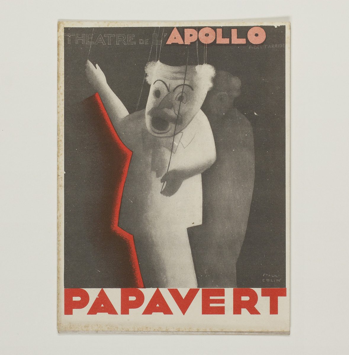
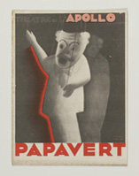
(Paul Colin) Charles K. Gordon: Papavert 1931
Programmheft des „Théatre de l'Apollo“, mit der Titelgestaltung von Paul Colin, 18 x 13,5 cm.
Paul Colin war 1925 mit der Gestaltung der Werbekampagne für Josephine Bakers sensationellen ersten Pariser Auftritt „Revue nègre“ zum gefeierten Grafik-Designer aufgestiegen, und fertigte in seiner über 40-jährigen Karriere allein über 1400 Plakatentwürfe an.
Das Theaterstück „Papavert“ von Charles K. Gordon nach einer Vorlage des gebürtigen Wieners Georg Fröschel (der als George Froeschel ab 1936 in Hollywood als Drehbuchautor Karriere machte) startete im Pariser Apollotheater nach einem Bericht aus dem „Figaro“ am 14. September 1931. Das (nie publizierte) Stück hatte Max Ophüls bereits zuvor unter dem Titel „Gerechtigkeit für Holubek“ in Breslau inszeniert. Die Pariser Version erlebte nach späterer persönlicher Aussage Fröschels 200 Aufführungen. Im Dezember 1931 wurde diese Version des Stückes in englischer Übersetzung für den New Yorker Broadway übernommen, wo es allerdings nach bereits zwei Vorstellungen wieder abgesetzt wurde, vermutlich wegen seiner schwer einzuordnenden politischen Tendenzen. Das Stück handelt von einem Mann, der sich – gerade nach neun Jahren aus dem Gefängnis entlassen, wo er unschuldig wegen angeblicher Ermordung eines Polizisten einsaß – für die kommunistischen Ideen des Liebhabers seiner Tochter instrumentalisieren lässt. Auch wenn es oberflächlich so aussieht, als ginge es um Kommunismus-Bashing, so ist die persönliche politische Haltung des Autors, der in den 1920er Jahren Chefdramaturg der UFA und danach Redakteur des Ullstein-Verlages und der Berliner Illustrierten Zeitung war, nicht so eindeutig zu benennen. Ambivalente Haltungen finden sich bei nicht wenig deutschen Autoren und Künstlern der Zeit, die zwar den Militarismus der Wilhelminischen Zeit ablehnten, aber auch an den gesellschaftlichen Auswüchsen und nicht zuletzt an dem politischen Versagen der Linken während der Weimarer Republik kein gutes Haar ließen. Schließlich war die Emigration des Juden Fröschel in die USA 1936 wohl nicht einzig allein durch die Aussichten auf berufliche Karriere begründet. „Holubek“ alias „Papavert“ – versinnbildlicht durch Colins Marionette – könnte allgemein für die Willfährigkeit des „kleinen Mannes“ (Wilhelm Reich) stehen, der sich leicht vor denjenigen politischen Karren spannen lässt, der die Deckung seiner Bedürfnisse gerade verspricht.
Papavert 1931
Programme for the ‘Théâtre de l’Apollo’, with cover design by Paul Colin, 18 x 13.5 cm.
Paul Colin had risen to prominence as a celebrated graphic designer in 1925 with his design for the advertising campaign for Josephine Baker’s sensational first Parisian performance, ‘Revue nègre’, and produced over 1,400 poster designs alone during his career spanning more than 40 years.
The play ‘Papavert’ by Charles K. Gordon, based on a work by the Vienna-born Georg Fröschel (who made a career as a screenwriter in Hollywood from 1936 onwards under the name George Froeschel), opened at the Théâtre de l’Apollo in Paris on 14 September 1931, according to a report in *Le Figaro*. Max Ophüls had previously staged the (never published) play in Breslau under the title ‘Justice for Holubek’. According to Fröschel’s later personal account, the Paris version ran for 200 performances. In December 1931, this version of the play was translated into English for Broadway in New York, where it was taken off the bill after only two performances, presumably because of its political leanings, which were difficult to categorise. The play is about a man who – having just been released from prison after nine years, where he had been wrongfully imprisoned for the alleged murder of a police officer – allows himself to be exploited by his daughter’s lover for his communist ideas. Although on the surface it appears to be an attack on communism, the personal political stance of the author – who was chief dramaturg at UFA in the 1920s and subsequently an editor at Ullstein Verlag and the Berliner Illustrierte Zeitung – is not so easy to pin down. Ambivalent attitudes were common amongst quite a few German authors and artists of the time, who, whilst rejecting the militarism of the Wilhelmine era, equally disapproved of the social excesses and, not least, the political failures of the Left during the Weimar Republic. After all, the emigration of the Jew Fröschel to the USA in 1936 was probably not motivated solely by the prospects of a professional career. ‘Holubek’, alias ‘Papavert’ – symbolised by Colin’s marionette – can also stand for the compliant nature of the ‘little man’ (Wilhelm Reich), who allows himself to be easily harnessed to whichever political cause promises to meet his needs at that particular moment.
|
90
|
| |
  |
|
| |
|
|
|
V 12
|
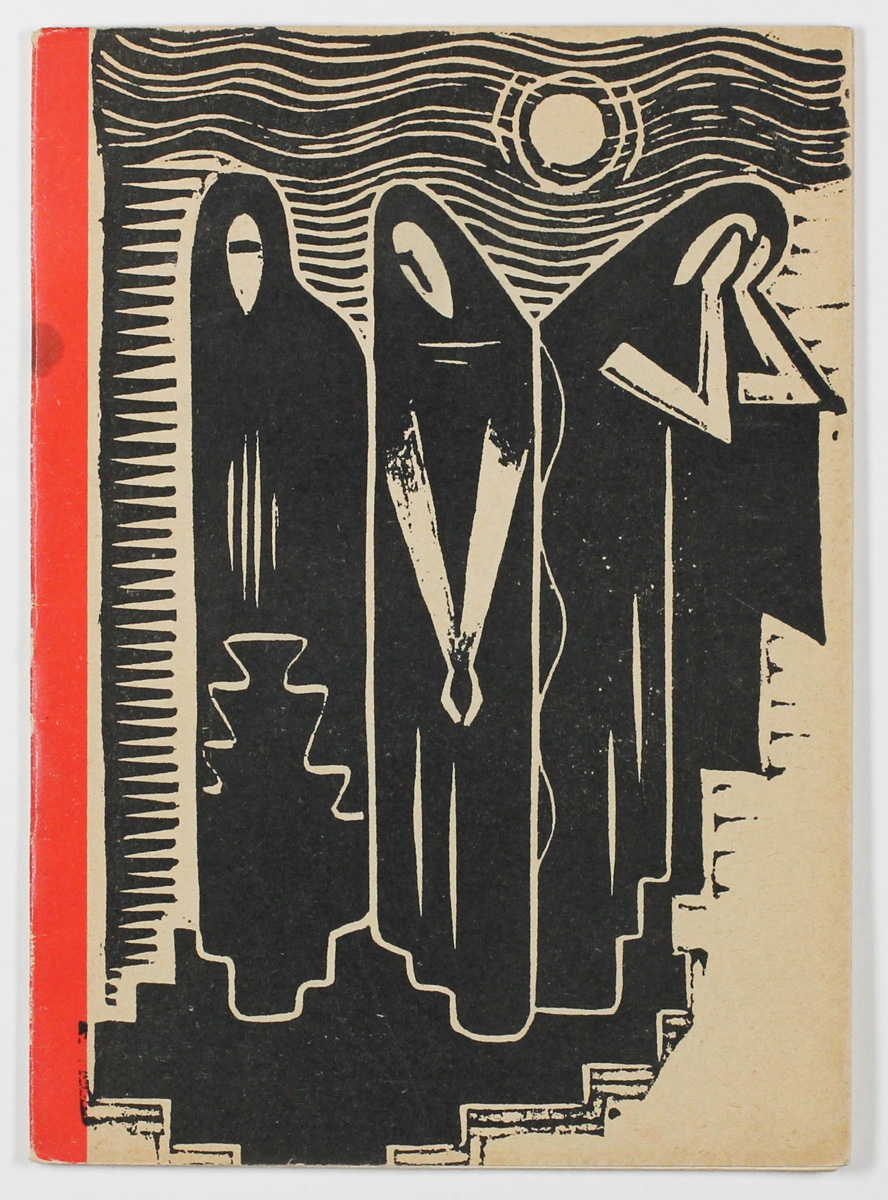
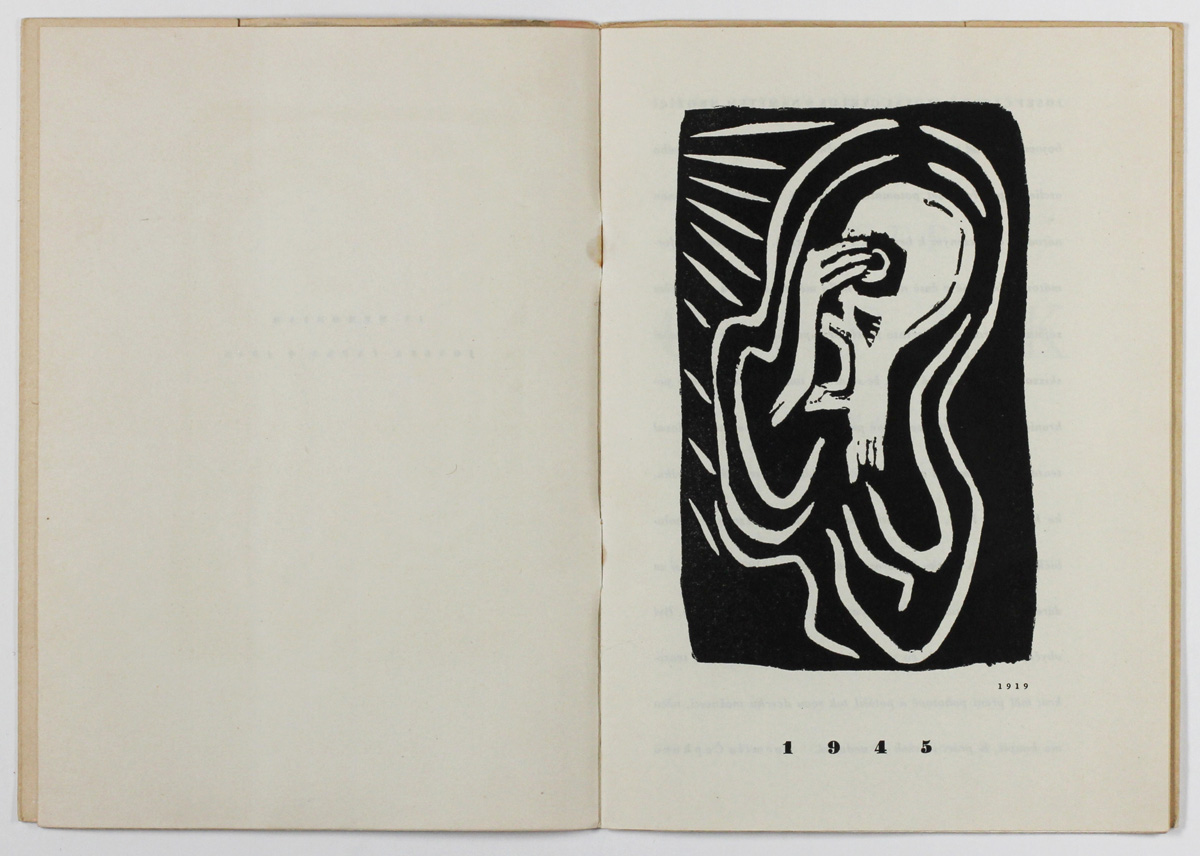
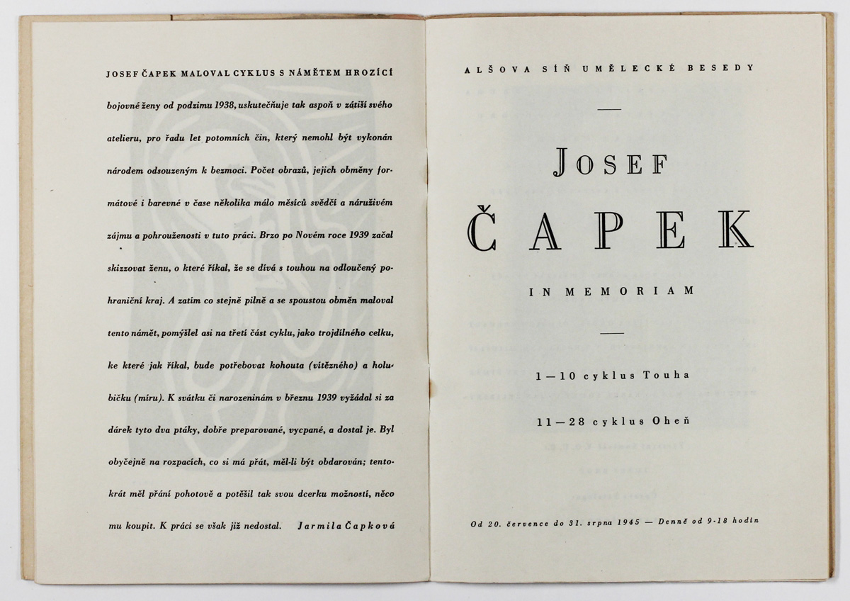
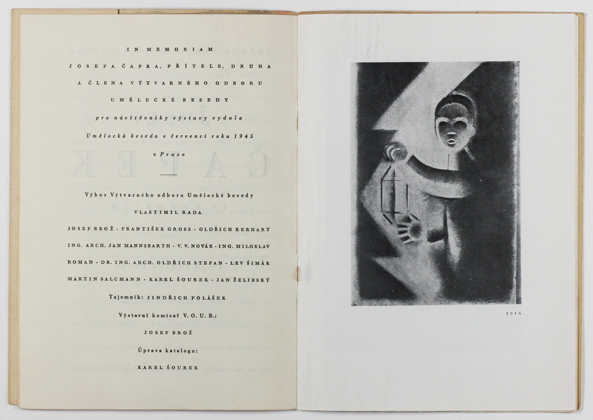
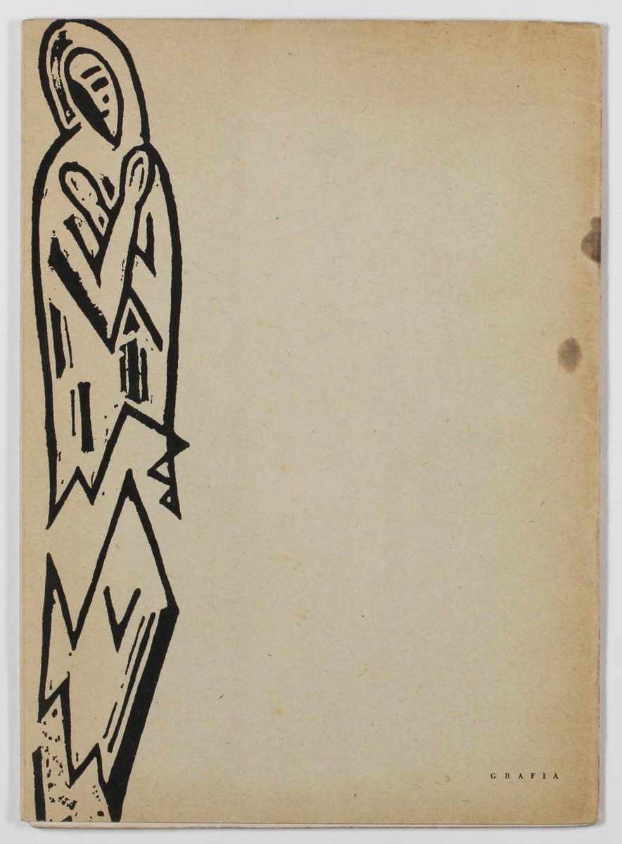
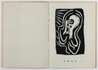
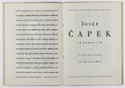
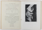
(Josef Čapek) Karel Šourek (Hrsg.): In Memoriam Josefa Čapka 1945
Or.-Broschur mit Reproduktion zweier Linolschnitte zu „Levana a Matky Žalu“ (Thomas de Quincey: Levana and Our Ladies of Sorrow) von Josef Čapek. 21,4 x 15,4 cm. 20 S. (nicht paginiert). Mit der Reproduktion des Linolschnittes „Pasmó“ (zu Apollinare) auf dem Vortitel und teils farbigen Reproduktionen nach Gemälden von Josef Čapek. Texte von Václav Rabas und Emil Filla. Im Todesjahr Čapeks von seiner Ehefrau Jarmila Čapková herausgegebener Katalog anlässlich der Gedächtnisausstellung vom 20. Juli bis 31. August 1945 im Aleš-Saal des Kunstvereins (Umělecká Beseda) Prag. Capek wurde 1945 in Bergen-Belsen von den Nazis ermordet.
In Memoriam Josef Čapek 1945
Original paperback with reproductions of two linocuts from ‘Levana a Matky Žalu’ (Thomas de Quincey: Levana and Our Ladies of Sorrow) by Josef Čapek. 21.4 x 15.4 cm. 20 pp. (unpaginated). With a reproduction of the linocut ‘Pasmó’ (based on Apollinaire) on the half-title page and partly coloured reproductions based on paintings by Josef Čapek. Texts by Václav Rabas and Emil Filla. A catalogue published by Čapek’s wife, Jarmila Čapková, in the year of his death, to mark the memorial exhibition held from 20 July to 31 August 1945 in the Aleš Hall of the Art Society (Umělecká Beseda) in Prague. Čapek was murdered by the Nazis in Bergen-Belsen in 1945.
|
40
|
| |
     |
|
| |
|
|
|
V 13
|
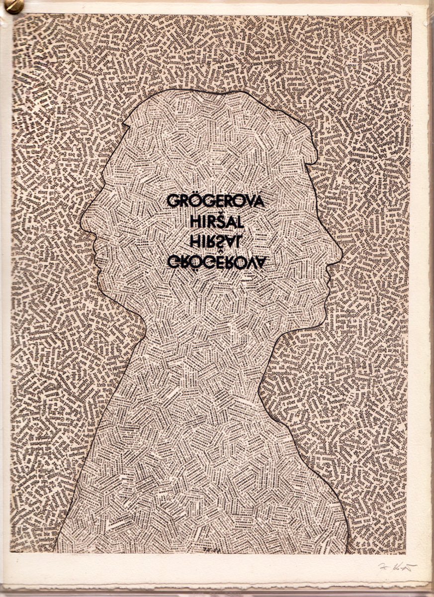
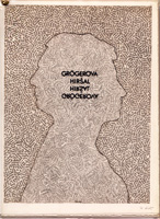
(Jiří Kolář) Bohumila Grögerova, Josef Hirsal: Intertexte 1970
Buchobjekt. Edition & Verlag Boczkowski, Kassel 1970/71. 30,8 x 22,3 cm. Mit einer signierten und nummerierten Heliogravüre nach einer Collage von Jiří Kolář. Eines von 40 Exemplaren. Im Druckvermerk von den beiden Autoren signiert.
Entgegen dem Impressum enthält das ungewöhnliche Künstlerbuch 12 (statt 10) "Intertexte" in Englisch, Deutsch und Französisch, die man am besten mit "Konkrete Poesie" umschreiben könnte. Die Grafik von Kolář als Titelillustration sowie die einzelnen Textblätter mit Text recto und verso stecken je in einer Klarsichthülle, wobei die Hüllen durch eine Messingschraube zusammengehalten werden.
Intertexte 1970
Book object. Edition & Verlag Boczkowski, Kassel 1970/71. 30.8 x 22.3 cm. With a signed and numbered heliogravure based on a collage by Jiří Kolář. One of 40 copies. Signed by both authors in the colophon.
Contrary to the colophon, this unusual artist's book contains 12 (instead of 10) 'intertexts' in English, German and French, which can be best described as 'concrete poetry'. Kolář's print, which serves as the title illustration, and the individual text sheets with text on both the recto and verso are each enclosed in a transparent sleeve, with the sleeves held together with a brass screw.
|
480
|
| |
 |
|
| |
|
|
|
V 14
|
(Gerd Arntz) Otto Neurath: De Moderne Mensch ontstaat (Modern man in the making) 1940
Een reportage van vreugde en vrees. N.V. Noord-Hollandsche Uitgevers Maatschappij, Amsterdam 1940. 4° (27,5 x 22 cm). 159 S. Übersetzung aus dem Amerikanischen ins Holländische von B. F. van Overdiep. Holländische Erstausgabe des 1939 zuerst in den USA erschienen epochalen Buches "Modern man in the making" des Wiener Ökonomen und Soziologen Otto Neurath mit den Illustrationen von Gerd Arntz. Mit dem seltenen Original-Schutzumschlag.
Modern Man in the Making 1940
Een reportage van vreugde en vrees (A report on joy and fear). N.V. Noord-Hollandsche Uitgevers Maatschappij, Amsterdam 1940. 4° (27.5 x 22 cm). 159 pp. Translated from the American into Dutch by B. F. van Overdiep. Dutch first edition of the seminal book ‘Modern Man in the Making’ by the Viennese economist and sociologist Otto Neurath, which was published in the USA in 1939, with illustrations by Gerd Arntz. With the rare original dust jacket.
"Visual impact was the key selling point of Modern Man in the Making. [...] Formally known as the Vienna Method, Neurath’s approach to visualizing statistical data, or ISOTYPE (International System of Typographic Picture Education), contributed to the book’s “reductive genius” [...] Gerd Arntz bore the responsibility for the general design of Modern Man in the Making. His extensive experience with modern and avant-garde publications no doubt informed his precise handling of layout to assemble “building blocks” of information." (Michael J. Golec: Otto Neurath’s Modern Man in the Making and Scientific Management.)
|
350
|
| |
 |
| |
    |
| |
|
|
|
V 15
|
Maurits Cornelis Escher: Matthäuspassion van Johann Sebastian Bach 1685 -1750 1938
Or.-Broschur mit Klammerheftung, 28 x 15,5 cm. Titelholzschnitt in violett von M.C. Escher, 15,2 x 10,4 cm (Stock). Der umrahmende Text von Eschers Holzschnitt lautet: „De Neederlandsche Bachvereeniging op Goeden Vrijdag in de Groote Kerk te Naarden“ (Die Niederländische Bachgesellschaft am Karfreitag in der Groote Kerk in Naarden). Textbuch von J. S. Bachs Matthäuspassion der Niederländischen Bachvereinigung, 1938 - ?. Abgedruckt ist der deutsche Originaltext, alle anderen Angaben sind auf Holländisch. Es fehlen die Angaben zu Ausführenden und zum Datum der Aufführung, wofür es für die jeweilige Aufführung einen eigenen Besetzungszettel gab. Die Matthäuspassion wurde erstmals 1921 von der Niederländischen Bachvereinigung anlässlich von deren Gründung in der „Groote Kerk“ in Naarden aufgeführt. Diese Tradition wird bis heute fortgeführt.
St Matthew Passion by Johann Sebastian Bach 1685–1750 1938
Original paperback with staple binding, 28 x 15.5 cm. Title woodcut in purple by M.C. Escher, 15.2 x 10.4 cm (block). The surrounding text of Escher’s woodcut reads: ‘De Neederlandsche Bachvereeniging op Goeden Vrijdag in de Groote Kerk te Naarden’ (The Dutch Bach Society on Good Friday in the Groote Kerk in Naarden). Libretto of J. S. Bach’s St Matthew Passion by the Dutch Bach Society, 1938 – ?. The original text of the Passion is printed in German; all other details are in Dutch. Details of the performers and the date of the performance are missing; a separate programme note was provided for each individual performance. The St Matthew Passion was first performed in 1921 by the Dutch Bach Society on the occasion of its foundation in the ‘Groote Kerk’ in Naarden. This tradition continues to this day.
|
300
|
| |
 |
|
| |
|
|
|
V 16
V 18
|
Hans Arp: Vers le blanc infini 1960
Künstlerbuch mit Gedichten und 8 ganzseitigen Radierungen von Hans (Jean) Arp. Lose Bögen in Chemise und Schuber. Blattmaß 38 x 28 cm. Plattenmaße der Radierungen 24 x 17 cm bis 32,5 x 24 cm. Hrsg. von La Rose des Vents, Lausanne/Paris 1960. Gedruckt im Atelier Georges Leblanc, Paris. Eines von 499 arabisch nummerierten und vom Künstler auf dem Titelblatt signierten Exemplaren.
Vers le blanc infini (Towards the Infinite White) 1960
Artist’s book with poems and 8 full-page etchings by Hans (Jean) Arp. Loose sheets in a folder and slipcase. Sheet size 38 x 28 cm. Plate sizes of the etchings range from 24 x 17 cm to 32.5 x 24 cm. Published by La Rose des Vents, Lausanne/Paris 1960. Printed at the Atelier Georges Leblanc, Paris. One of 499 Arabic-numbered copies, signed by the artist on the title page.
|
Buch komplett 2000
|
| |
    |
|
| |
   |
|
| |
|
|
|
V 17
|
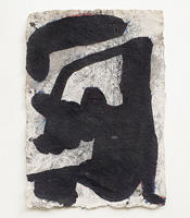
Wolfgang Seierl: Sieben Vorstudien zu Leckcja Krakowska 1992
Je Tusche und Aquarell auf handgeschöpftem Papier, ca. 22 x 15 cm (Blatt).
Die Studien entstanden als Vorbereitung zur Grafikmappe „Leckcja Krakowska“ mit 7 Lithographien auf handgeschöpftem Papier (je ca. 35 x 27 cm) einem Titelblatt sowie einem Textblatt mit 7 Aphorismen des polnischen Dichters Jerzy Michał Wąsik im Selbstverlag des Künstlers. Auflage: 5 Exemplare. Die Mappe ist für 1900 € ebenfalls in der Galerie Hochdruck erhältlich. Ansicht auf Anfrage.
Dem hier ausgestellten Blatt entspricht das Blatt 4 der Grafikmappe mit dem dazugehörigen Aphorismus von Jerzy Michał Wąsik:
Hiroszima była pierwsza - Twój syn ostatni , las przypomni Ci los ,
ocean zapomni, ze kochałeś a góry będą blizej słońca.
(Hiroshima war der Erste – dein Sohn der Letzte; der Wald wird dich an dein Schicksal erinnern,
der Ozean wird vergessen, dass du geliebt hast, und die Berge werden der Sonne näher sein.)
Seven preliminary studies for ‘Leckcja Krakowska’ 1992
Each in indian ink and watercolour on handmade paper, approx. 22 x 15 cm (sheet).
The studies were created in preparation for the print portfolio ‘Leckcja Krakowska’, with 7 lithographs on handmade paper (each approx. 35 x 27 cm), a title page and a text sheet featuring 7 aphorisms by the Polish poet Jerzy Michał Wąsik, self-published by the artist. Edition: 5 copies. The portfolio is also available at Galerie Hochdruck. Viewing by request.
The drawing exhibited here corresponds to sheet 4 of the portfolio, with the accompanying aphorism by Jerzy Michał Wąsik:
Hiroshima was the first – your son the last; the forest will remind you of your fate,
The ocean will forget that you loved, and the mountains will be closer to the sun.
|
je 500
|
| |
 |
|
| |
|
|
|
W 24
|
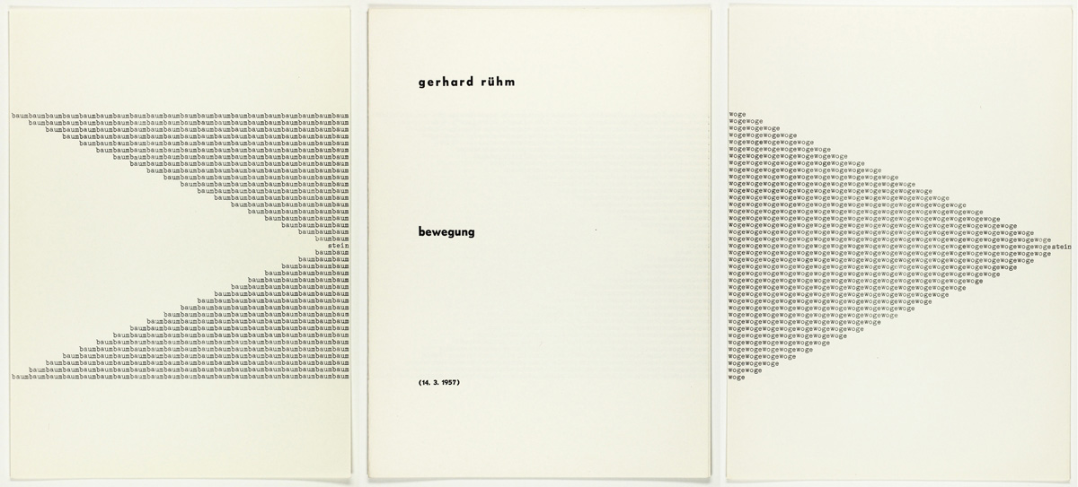
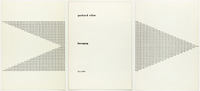
Gerhard Rühm: Bewegung 1957/1964
Sonderdruck der "Eröffnungen" als Beilage der Nummer 12/1964. 29 x 21,1 cm. Hrsg. von H. F. Kulterer, Bleiburg Kärnten. Druck der Madress Gesellschaft Wien. Umschlag mit Titel recto und Impressum verso, sowie vier lose eingelegten typografischen Einzelblättern: baum 1, baum 2, woge, stern. Auf dem Titel im Druck datiert 14.3.1957. Eines von 1000 unsignierten Exemplaren.
Movement 1957/1964
Special edition of “Eröffnungen” as a supplement to issue 12/1964. 29 x 21.1 cm. Edited by H. F. Kulterer, Bleiburg, Carinthia. Printed by Madress Gesellschaft, Vienna. Cover with the title on the recto and the imprint on the verso, together with four loose, typographic single sheets: tree 1, tree 2, wave, star. The title page bears the printed date 14 March 1957. One of 1,000 unsigned copies.
|
60
Rahmen 140
|
| |
 |
|
| |
|
|
|
W 25
|
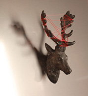
Curt Stenvert: LORD BYRON WAS ROMAnTIC 1971
Objekt. Bronze, Spiegel, Faden in Holzkasten mit Metallrahmen. 41,5 x 41 x 4,4 cm. Im Kasten unten mit Schriftfolie betitelt, signiert, datiert und mit der Werknummer 525 versehen. An der Kastenrückseite mit Widmung von Curt Stenvert „Herrn Helmut Dudé/zugedacht Curt Stenvert/Basel 16.5.1971“
LORD BYRON WAS ROMAnTIC 1971
Object. Bronze, mirror, thread in a wooden box with a metal frame. 41.5 x 41 x 4.4 cm. On the bottom of the box, titled, signed, dated, and marked with the work number 525 with lettering foil. On the back of the box, a handwritten dedication by Curt Stenvert: “To Mr. Helmut Dudé / Dedicated by Curt Stenvert / Basel, May 16, 1971”
|
2500
|
| |
  |
|
| |
|
|
|
W 26
|
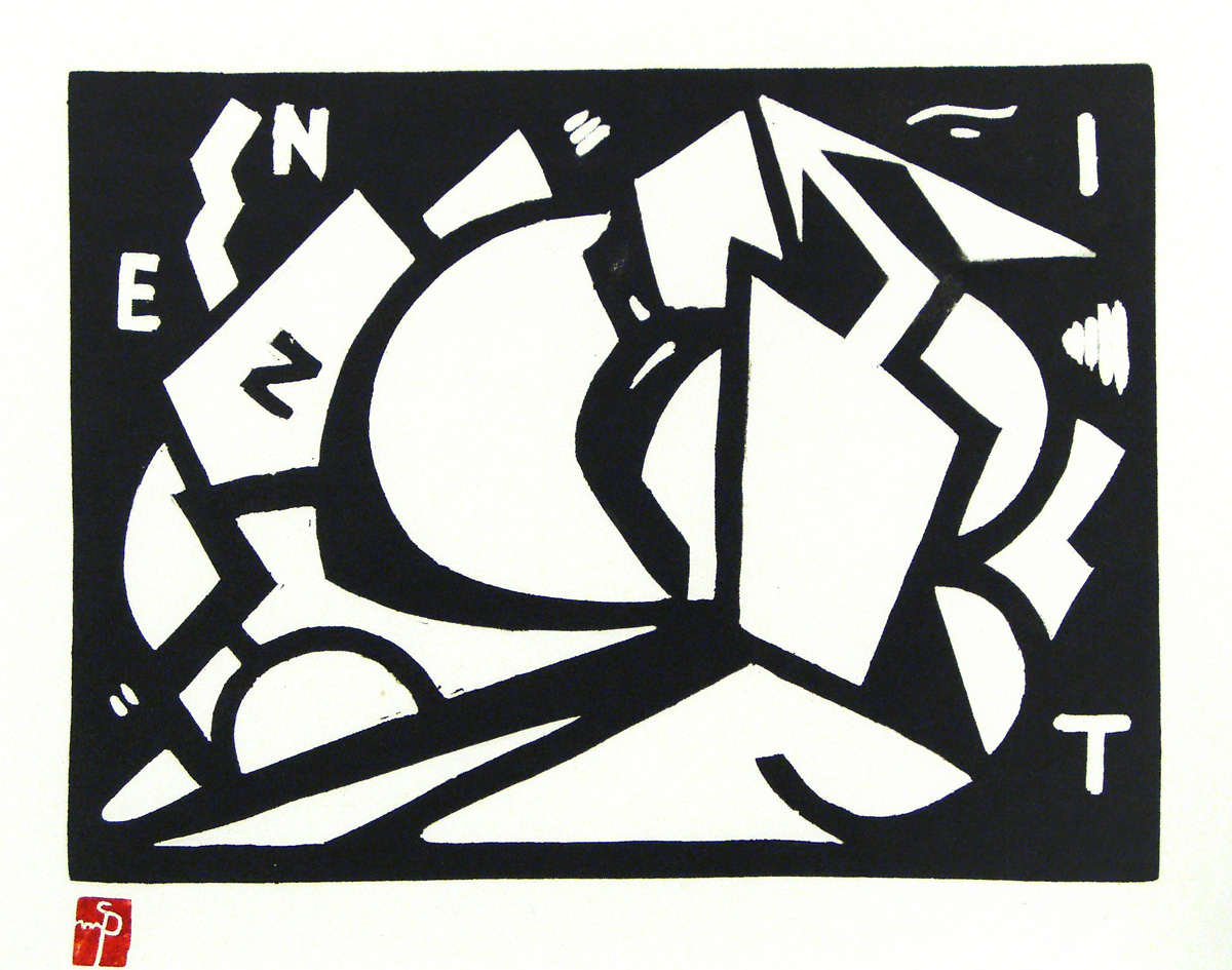
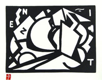
Mihailo S. Petrov: Zenit 1922/1973
Linolschnitt auf Büttenpapier, 18 x 24 cm (Platte). Späterer Druck aus der Mappe: "Mihailo S. Petrov Sedam linoreza : 1921-1922", Belgrad 1973. Eines von 30 Exemplaren mit dem roten Monogrammstempel.
Zenit 1922/1973
Linocut on laid paper, 18 x 24 cm (plate). Later print from the portfolio: ‘Mihailo S. Petrov Sedam linoreza: 1921–1922’, Belgrade 1973. One of 30 copies with the red monogram stamp.
|
400
|
| |
 |
|
| |
|
|
|
W 27
|
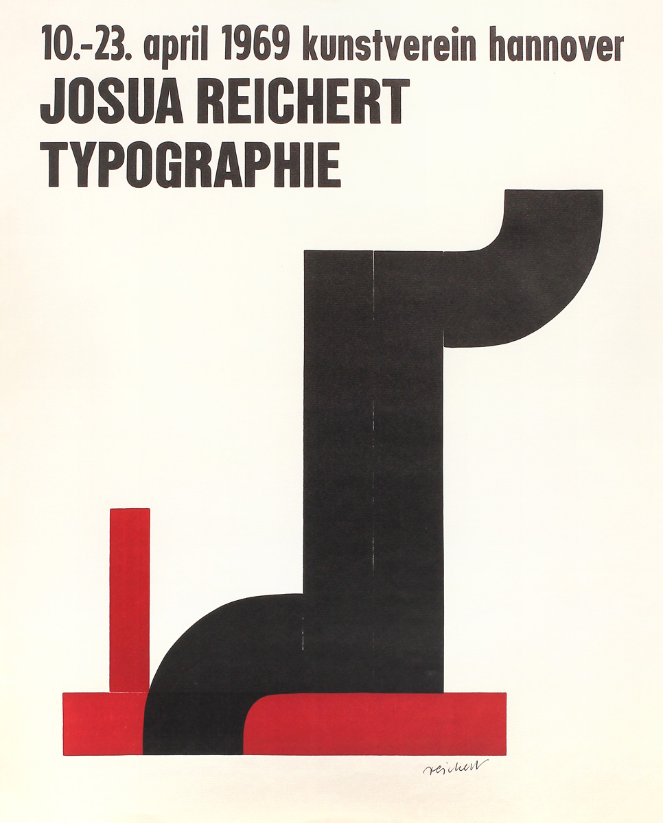
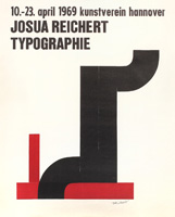
Joshua Reichert: Typographie 1969
Plakat des Kunstvereins Hannover zur Ausstellung "Typographie" von Josua Reichert vom 10. bis 23. April 1969. Buchdruck, Holztypen, Holztypenrückseiten und PVC-Schnitt auf Bugrabütten, 61 x 49 cm. Eines von 80 signierten Exemplaren der Vorzugsauflage. Referenz: Pfäfflin/Maurice P63
Typography 1969
Poster by the Kunstverein Hannover for the exhibition 'Typographie' by Josua Reichert, held from 10 to 23 April 1969. Letterpress printing, wooden type, wooden type backs, and PVC cut on Bugra paper, 61 x 49 cm. One of 80 signed copies from the special edition. Reference: Pfäfflin/Maurice P63
|
400
|
| |
 |
|
| |
|
|
|
W 28
|
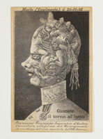
Monogrammist FM: Morto (finalmente) um 1914/1916
Die gesamte Bildüberschrift dieser Bildpostkarte (13,8 x 8,9 cm) mit der Darstellung der 7 Todsünden in Form der Porträtbüste von Kaiser Franz Joseph II à l‘Arcimboldo lautet: Francesco Giuseppe, Imperatore d'Austria - Morto (finalmente) il 21-11-16. Lichtdruck (?) nach einem älteren (?) Stich und gedrucktem Text "Francesco Giuseppe, Imperatore d'Austria / Caricatura allegorica del Risorgimento / (da una stampa dell'epoca sequestrata dal I. R. Governo)" (Franz Joseph, Kaiser von Österreich / Allegorische Karikatur des Risorgimento / nach einem zeitgenössischem Stich, der von der k. k. Regierung beschlagnahmt wurde).
Das Motiv lehnt sich an die berühmten, z. T. im Kunsthistorischen Museum in Wien befindlichen Gemälde mit Phantasieköpfen des Giuseppe Arcimboldo, eines Malers des italienischen Manierismus, an. Arcimboldo war zwischen 1562 und 1587 Hofmaler der Habsburger in Wien und Prag. Die Hassfigur Kaiser Franz Joseph als Personifikation der habsburgischen Territorialforderungen stand der Einigung Italiens (=Risorgimento) entgegen. Seine Porträtbüste ist hier aus Personifikationen der sieben Todsünden sowie einem Säugling (=Italien als Nation), der von einem Dämon namens "Austria" gesäugt, gleichzeitig aber von einer Schlange mit Namen Tirannia (Tyrannei), Despotismo (Despotismus), Ingiustizia (Ungerechtigkeit), Gesuitismo (Jesuitentum), Assolutismo (Absoultismus) und Ingratitudine (Undankbarkeit) erwürgt wird, zusammengesetzt. Der Text im Bild "Giocate il terno al lotto (Spielt Lotterie!)" dürfte schon bei der Herausgabe, möglicherweise zu Kriegsbeginn 1914, auf der Karte aufgedruckt gewesen sein, der übergestellte Text "Morto (finalmente) il 21-11-16" erst nachträglich aufgestempelt, um der Karte dem Anlass entsprechend Aktualität zu geben.
Dead (at last) c. 1914/1916
The full caption on this picture postcard (13.8 x 8.9 cm), with the seven deadly sins depicted in the form of a portrait bust of Emperor Franz Joseph I in the style of Arcimboldo, reads: Francesco Giuseppe, Emperor of Austria – Dead (at last) on 21 November 1916. Phototype (?) based on an older (?) engraving and printed text: ‘Francesco Giuseppe, Imperatore d'Austria / Caricatura allegorica del Risorgimento / (da una stampa dell’epoca sequestrata dal I. R. Governo)’ (Franz Joseph, Emperor of Austria / Allegorical caricature of the Risorgimento / based on a contemporary engraving confiscated by the Imperial and Royal Government).
The motif is inspired by the famous paintings with fantasy heads by Giuseppe Arcimboldo, an Italian Mannerist painter, some of which are housed in the Kunsthistorisches Museum in Vienna. Arcimboldo was court painter to the Habsburgs in Vienna and Prague between 1562 and 1587. Emperor Franz Joseph, a figure of hatred and the personification of the Habsburgs’ territorial claims, stood in the way of the unification of Italy (= Risorgimento). His portrait bust is depicted here as a composite of personifications of the seven deadly sins, together with an infant (= Italy as a nation), who is being suckled by a demon named ‘Austria’, whilst at the same time being strangled by a serpent named Tirannia (Tyranny), Despotismo (despotism), Ingiustizia (injustice), Gesuitismo (Jesuitism), Assolutismo (absolutism) and Ingratitudine (ingratitude). The text in the image, ‘Giocate il terno al lotto (Play the lottery!)’, was likely already printed on the card when it was issued, possibly at the outbreak of the war in 1914, whilst the superimposed text ‘Morto (finalmente) il 21-11-16’ was only stamped on later to make the card more topical in light of current events.
|
120
|
| |
 |
|
| |
|
|
|
W 29
|
Wenzel Hollar: The fable of the viper and the file (Die Fabel von der Viper und der Feile) 1665
Radierung mit späterem Kolorit, 22,4 x 16,7 cm (Darstellung). Platte 26 x 17,2 cm (unterer blanker Plattenrand beschnitten). Illustration zu: John Ogilby, The Fables of Æsop Paraphras'd in Verse: Adorned with Sculpture and Illustrated with Annotations, London 1665. Referenz: The New Hollstein 1878, Pennington 354
In der auf dieser Radierung dargestellten Fabel wird erzählt, dass es sich um die Werkstatt eines Bildhauers handelt und dass der Drache und der Kopf der Gorgone kürzlich fertiggestellt wurden. Eine Schlange ist in den Raum geschlichen und greift – sei es aus Hunger oder aus rachsüchtigem Zorn über das, was die Feile der Gorgone angetan hat – die Feile an. Je mehr sie kämpft, desto blutiger und schwächer wird sie. Die Feile bleibt unversehrt. Zugleich mit der Fabel enthält die Darstellung eine Referenz auf aktuelle politische Ereignisse rund um den Englischen Bürgerkrieg, Cromwell und die Restauration Karls II. Cromwells Elite-Kavallerieregiment war als die „Ironsides“ bekannt. Der geflügelte Drache war sowohl ein Symbol für die Parlamentarier (als Symbol für die Unterdrückung durch die Monarchie) als auch später ein Symbol für Karl II. Im Jahr 1661, am Jahrestag der Hinrichtung Karls I., wurde Cromwells Leichnam exhumiert, und sein abgetrennter Kopf wurde mindestens 20 Jahre lang auf einer Stange in Westminster ausgestellt, sodass er sich dort noch befunden haben dürfte, als das Buch veröffentlicht wurde.
The fable of the viper and file 1665
Etching with later colouring, 22.4 x 16.7 cm (image). Plate 26 x 17.2 cm (lower blank plate mark trimmed). Illustration for: John Ogilby, ‘The Fables of Æsop Paraphras’d in Verse: Adorned with Sculpture and Illustrated with Annotations’, London 1665. Reference: The New Hollstein 1878, Pennington 354
The fable the etching details, tells that this is the foundry of a sculptor and that the Dragon and the Gorgon’s head are recently completed works. A snake has wandered into the room, and in hunger, or in vengeful anger at the work the file has done to the Gorgon, has attacked the file. The more it fights, the bloodier and weaker it becomes. The file remains unscathed. As well as the fable, the picture refers to recent political events around the English civil war, Cromwell, and the restoration of Charles II. Cromwell’s elite Cavalry regiment was known as the ironsides. The winged dragon was a symbol for both the parliamentarians (representing oppression by the monarchy) and later a symbol for Charles II. In 1661, on the anniversary of the execution of Charles I, Cromwell’s body was exhumed, and his severed head displayed on a pole in Westminster for at least 20 years, so it would have been there when the book was published.
|
300
|
| |
 |
|
| |
|
|
|
W 30
|
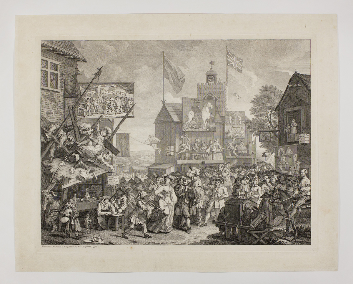
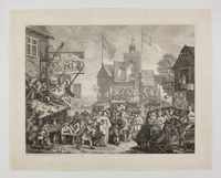
William Hogarth: Southwark Fair 1733
Kupferstich und Radierung auf festem, strukturiertem Büttenpapier des 18. oder frühen 19. Jahrhunderts, 36,3 x 47 cm (Platte), 43 x 54 cm (Blatt, leicht beschnitten). Referenz: Paulson 131; Arndt 7. Provenienz: Asta Nielsen (laut handschriftlichem Vermerk auf Rückwand von alter Rahmung: "Gehört/Asta Nielsen/ Grossbeerenstrasse 95/Berlin/SW II"
Southwark Fair 1733
Engraving and etching on firm, textured laid paper from the 18th or early 19th century, 36.3 x 47 cm (plate), 43 x 54 cm (sheet, slightly trimmed). Reference: Paulson 131; Arndt 7 Provenance: Asta Nielsen (according to the handwritten note on the reverse of the old framing: "Gehört/Asta Nielsen/ Grossbeerenstrasse 95/Berlin/SW II"
|
750
|
| |
 |
|
| |
|
|
|
W 31
|
Lukas Cranach d.Ä. (nach): Das Munchkalb zu freyberg 1523
Holzschnitt auf Büttenpapier, 16,5 x 10,6 cm (Blatt). Einblattdruck des 16. Jahrhundert. Erstmals abgedruckt in: Philipp Melanchthon/Martin Luther: Deuttung der czwo grewlichen Figuren Bapstesels czu Rom und Munchkalbs zu Freyberg ynn Meysszen funden (Deutung der zwei gräulichen Figuren Papstesels zu Rom und Mönchskalbs zu Freiberg in Meißen gefunden). Wittemberg 1523.
Diese Kampfschrift gegen das katholische Papsttum gehört zu den bösesten und drastischsten Pamphleten der Zeit und wurde in zahlreichen Ausgaben verbreitet. Ein in Freiberg geborenes monströses Kalb, das angeblich Ähnlichkeit mit einem Mönch hatte, war mehrfach auf Luther gedeutet worden. Mit dem drastischen Holzschnitt von Cranach versehen, dreht Luther die Deutung um und bezieht die Missgeburt allegorisch auf den völlig verderbten und verweltlichten Zustand des Klerus und der Klöster.
The calf in the form of a monk found at Freyberg 1523
Woodcut on laid paper, 16.5 x 10.6 cm (sheet). A single-sheet print from the 16th century. First published in: Philipp Melanchthon/Martin Luther: Deuttung der czwo grewlichen Figuren Bapstesels czu Rom and Munchkalbs zu Freyberg ynn Meysszen funden (Interpretation of the two ghastly figures of the Pope as a donkey in Rome and the Calf in the form of a monk found at Freiberg in Meissen). Wittenberg 1523.
This polemic against the Catholic papacy ranks among the most vitriolic and drastic pamphlets of the time and was circulated in numerous editions. A monstrous calf born in Freiberg, which was said to resemble a monk, had on several occasions been interpreted as a reference to Luther. With Cranach’s stark woodcut, Luther turns the interpretation on its head and uses the monstrosity as an allegory for the utterly corrupt and worldly condition of the clergy and the monasteries.
|
1200
|
| |
 |
|
| |
|
|
|
W 32
|
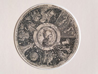
Johann Theodor de Bry: Orgueille et Follie (Stolz und Torheit) 1558
Kupferstich und Radierung auf Büttenpapier, 12,8 cm (Plattendurchmesser). Aus einer Serie reich verzierter Tazza-Entwürfe mit Medaillons. Dargestellt – abgesehen von den Personifikationen von Superbia (Stolz) und Torheit (hier als untrennbar miteinander verbundene siamesische Zwillinge gedeutet) – sind die Versuchung von Adam und Eva, der Sturz des Phaethon, die große Hure von Babylon sowie Ornamente in Form von Mischwesen. Referenz: Hollstein Dutch and Flemish, IV.47.18
Pride and Folly 1558
Engraving and etching on laid paper, 12.8 cm (plate diameter). From a series richly ornamented tazza designs with medallions. The scenes depicted – apart from the personifications of Superbia (Pride) and Folly (here interpreted as inextricably linked Siamese twins) – include the temptation of Adam and Eve, the fall of Phaethon, the great whore of Babylon and ornaments in the form of hybrid creatures. Reference: Hollstein Dutch and Flemish, IV.47.180
|
1800
|
| |
 |
|
| |
|
|
|
W 33
|
Ambrosius Holbein: Buchdruckerzeichen Ionannes Frobenius 1518
Metallschnitt auf Büttenpapier (Platte 9,4 x 7 cm) von Jacob Faber nach einer Vorzeichnung von Ambrosius Holbein, dem älteren Bruder von Hans Holbein. Der erste nachweisbare Basler Metallschnitt fand seine erstmalige Verwendung auf dem Schlussblatt von: C. Suetonius Tranquillus. Dion Cassius Nicaeus... Ex recognitione Des. Erasmi Roterodami. Basel, Ionannes Frobenius, Juni 1518. Referenz: Hieronymus (Oberrheinische Buchillustration 2) Kat. 241
Ionannes Frobenius’s printer’s mark 1518
Metal engraving on laid paper (plate 9.4 x 7 cm) by Jacob Faber after a preliminary drawing by Ambrosius Holbein, the elder brother of Hans Holbein. The first documented Basel metal engraving was first used on the final page of: C. Suetonius Tranquillus. Dion Cassius Nicaeus... Edited by Des. Erasmus of Rotterdam. Basel, Ionannes Frobenius, June 1518. Reference: Hieronymus - Oberrheinische Buchillustration 2 (Upper Rhine Book Illustration 2) Cat. 241
|
180
|
| |
 |
|
| |
|
|
|
W 34
|
Anonym: Papiermacherzeichen des Paulus Hertel zu Kirchberg 1639
Holzschnitt mit zeitgenössischem Kolorit auf Büttenpapier, 23 x 13 cm (Blatt - Ränder beschnitten). Einbandfund. Papiermacherzeichen mit Inschrift "Paulus Hertel zu Kirchberg 1639".
Anonymous: Papermaker’s mark of Paulus Hertel of Kirchberg 1639
Woodcut with contemporary colouring on laid paper, 23 x 13 cm (sheet – margins trimmed). Found in an old book binding. Papermaker’s mark with the inscription ‘Paulus Hertel of Kirchberg 1639’.
|
300
|
| |
 |
|
| |
|
|
|
W 35
|
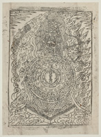
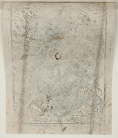
Anonym: Göttergestalt mit Mandala
Göttergestalt mit multiplen Gesichtern und Pfeil und Bogen. Davor ein in konzentrischen Kreisen aufgebautes Spruchband mit Mantren. Holzschnitt auf Nepalpapier, ca. 34 x 24,5 cm (Blatt). Auf altem PP-Karton verso (fälschlich?) in Bleistift bezeichnet: "Kwannon has multiple heads".
Entgegen der rückseitigen englischen Beschreibung dürfte es sich bei der Darstellung um die tibetanische Schutzgöttin Mahāpratisarā handeln, die im Vajrayana-Buddhismus für Wunscherfüllung, Krankheitsheilung und karmischen Schutz angerufen wird.
Anonymous: Deity figure with mandala
Deity figure with multiple faces, holding a bow and arrow. In front of it, a banner arranged in concentric circles bearing mantras. Woodcut on Nepalese paper, approx. 34 x 24.5 cm (sheet). On the verso, on old PP cardboard, (incorrectly?) inscribed in pencil: 'Kwannon has multiple heads'.
Contrary to the English description on the reverse, it is likely that the depiction is Mahāpratisarā, the Tibetan protective goddess, who is invoked in Vajrayana Buddhism for the fulfilment of wishes, healing from illness and karmic protection.
|
100
|
| |
  |
|
| |
|
|
|
W 36
|
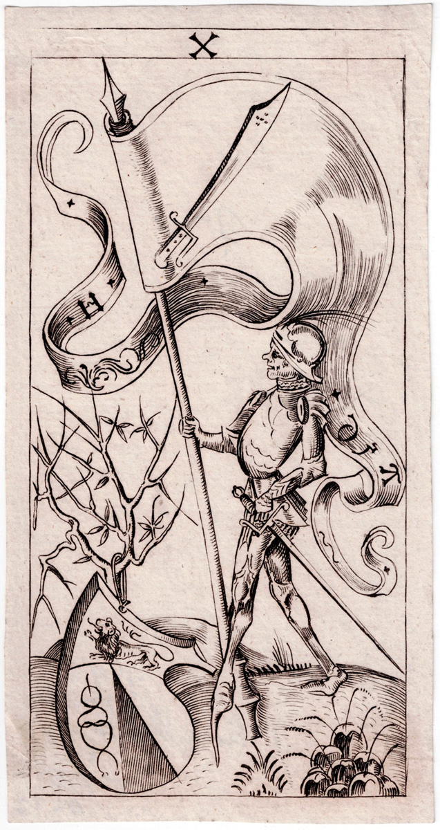
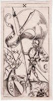
Anonym: Schwerter Zehn ca. 1496
Kupferstich auf Büttenpapier, 13 x 7 cm (Platte). Kopie des 18. Jahrhunderts. Referenz: British Museum Inv.nr. 1896,0501.1431
Diese Spielkarte aus dem Kupferstichspiel eines süddeutschen Stechers aus dem späten 15. Jahrhundert wurde im Originalformat und als Nachstich abgedruckt in Johann Gottlieb Immanuel Breitkopf's "Versuch den Ursprung der Spielkarten, die Einführung des Leinenpapieres und den Anfang der Holzschneidekunst in Europa zu erforschen" von 1784 (Verlag J.G.I. Breitkopf Leipzig). Dort waren alle Bilder des Spieles zusammen auf einem Faltblatt nachgestochen worden. Die Bezeichnung bei Breitkopf war: "Deutsche Piquet-Karten aus den XV Jahrhunderte mit Trappola Blättern". Aufgrund des Papierbeschaffenheit des vorliegenden Blattes muss davon ausgegangen werden, dass das Bild der Schwerter-Zehn aus dem Blatt mit Breitkopfs Nachstichen ausgeschnitten wurde. Die vermutlich heute nur noch in unikaten Exemplaren vorliegenden Originale befinden sich in der Albertina in Wien, bezeichnet „Spielkarten mit italienischen Farbzeichen eines süddeutschen Stechers“.
(siehe https://www.albertina.at/presse/ausstellungen/faszination-papier/)
Ten of Swords c. 1496
Engraving on laid paper, 13 x 7 cm (plate). 18th-century copy. Reference: British Museum Inv. No. 1896,0501.1431
This playing card, from a set of engravings by a South German engraver dating from the late 15th century, was reproduced in its original format and as a re-engraving in Johann Gottlieb Immanuel Breitkopf’s book ,Versuch den Ursprung der Spielkarten, die Einführung des Leinenpapieres und den Anfang der Holzschneidekunst in Europa zu erforschen' (An Attempt to Investigate the Origin of Playing Cards, the Introduction of Linen Paper and the Beginnings of Woodcut Art in Europe), published in 1784 (J.G.I. Breitkopf, Leipzig). There, all the images of the deck had been re-engraved together on a single leaflet. Breitkopf’s description was: “German piquet cards from the 15th century with Trappola suits”. Given the nature of the paper used for present card, it must be assumed that the image of the Ten of Swords was cut out from the sheet containing Breitkopf’s re-engraved illustrations. The originals, of which presumably only single copies remain today, are held at the Albertina in Vienna, described as ‘playing cards with Italian suit symbols by a South German engraver’. (see https://www.albertina.at/presse/ausstellungen/faszination-papier/)
|
nicht verkäuflich
|
| |
 |
|
| |
|
|
Gstk 1
|
Florentina Pakosta: Schnabelkopf I 1976
Mezzotinto auf Velinpapier, 9,5 x 15,8 cm (Platte), ca. 39 x 31 cm (Blatt). Eines von 50 signierten und nummerierten Exemplaren. Referenz: Breicha 1977, Abb. 40
Beak Head I 1976
Mezzotint on wove paper, 9.5 x 15.8 cm (plate), approx. 39 x 31 cm (sheet). One of 50 signed and numbered copies. Reference: Breicha 1977, fig. 40
|
1200
|
| |
  |
|
| |
|
|
|
Gstk 2
|
Karl Schmidt-Rottluff: Exlibris Else Weiske 1914
Holzschnitt auf festem Velinpapier, 13 x 9,5 cm (Stock). 14 x 10,6 cm (Blatt). Referenz: Schapire Gebrauchsblätter 37; Gerlinger/Schneider (2005) 136. Provenienz: Sammlung Hermann Gerlinger, mit dem Stempel verso (Lugt 6032).
Exlibris Else Weiske 1914
Woodcut on strong wove paper, 13 x 9,5 cm (block). 14 x 10,6 cm (sheet). Reference: Schapire Gebrauchsblätter 37; Gerlinger/Schneider (2005) 136. Provenance: Collection Hermann Gerlinger, with the stamp on verso (Lugt 6032).
|
750
|
| |
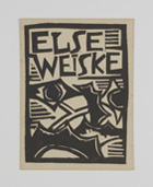 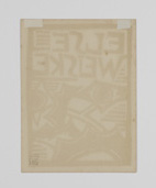 |
|
| |
|
|
|
Gstk 3
|
Josef Achmann: Signet für die Zeitschrift "Die Sichel" 1919
Holzschnitt auf unregelmäßig gerissenem Velin, 10,1 x 7,5 cm (Stock), ca. 26,5 x 20 cm (Blatt). Vom Künstler signiert, datiert und nummeriert. Probedruck vor der photomechanischen Verkleinerung und Verwendung als Logo für die Zeitschrift „Die Sichel“. Referenz: Haslbeck 99
Logo for the magazine ‘Die Sichel’ 1919
Woodcut on irregularly torn wove paper, 10.1 x 7.5 cm (block), approx. 26.5 x 20 cm (sheet). Signed, dated and numbered by the artist. Trial proof prior to photomechanical reduction and use as a logo for the magazine ‘Die Sichel’. Reference: Haslbeck 99
|
650
|
| |
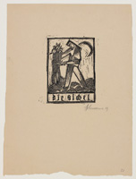 |
|
| |
|
|
|
Gstk 4
|
Anonym: Schreibmeisterblatt 18. Jahrhundert
Feder und Tinte auf Velinpapier, 19,5 x 24 cm.
Anonymous: A writing sample by a master calligrapher 18th century
Pen and ink on wove paper, 19,5 × 24 cm.
|
900
|
| |
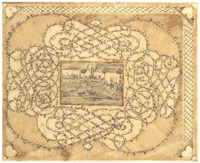 |
|
| |
|
|
|
Gstk 5
|
Anonym: Antiphonarblatt um 1450
Blatt aus einem ostfranzösischen Antiphonar (Besançon ?), Mitte 14. Jahrhundert. Feder mit roter, blauer und schwarzer Tusche auf Pergament, recto und verso. 29, 4 x 21,7 cm. Manuskript mit Quadratnotation auf 4 Linien. Choraltext in gotischer Minuskel. Zahlreiche Schmuckinitialen, teilweise mit eingemalten grotesken Köpfen.
Anonymous: Page from an antiphonary c. 1450
A sheet from an antiphonary from eastern France (Besançon?), mid-14th century. Pen and red, blue and black Indian ink on vellum, both recto and verso. 29, 4 × 21,7 cm. Manuscript with square notation on four lines. Choral text in Gothic minuscule. Numerous ornamental initials, some with painted grotesque heads.
|
900
|
| |
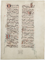 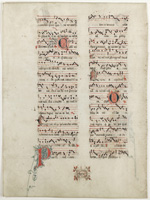 |
|
| |
|
|
|
Gstk 6
|
Johannes Herbort: Threni Hieremie 1483
Buchdruck und Feder mit verschiedenfarbigen Tinten auf Bütten, 28,2 x 20,6 cm. Blatt mit den Klageliedern des Jeremias aus einer lateinischen Bibel - einer sogenannten Fontibus ex Graecis Ausgabe, also einer gegenüber zeitgenössischen Vulgata-Ausgaben "korrigierten" Fassung - des Johannes Herbort, Venedig 1483. Durchgehend rubriziert, mit zwei großen Initialen Q und R, einer Schmuckinitiale "L" und Marginalien, darunter zwei "Zeigefinger" zum Memorieren wichtiger Stellen.
"No doubt the familiar opening of Cicero's oration "Quousque tandem abutere, Catilina" has had considerable influence on the shape of the capital letter Q [...] I do not say that Q 's have long tails because Cicero delivered an oration against Catiline; but that the tails of some Q 's would not be as long as they are if the oration had begun with some other word!" (Daniel Berkeley Updike: Printing Types - Their History, Forms and Use, New York 1980/Reprint der Ausgabe 1937).
Lamentations of Jeremiah 1483
Letterpress and pen with various colours of ink on laid paper, 28,2 × 20,6 cm. A sheet containing the Lamentations of Jeremiah from a Latin Bible – a so-called ‘Fontibus ex Graecis’ edition, that is, a version ‘corrected’ in comparison with contemporary Vulgate editions – by Johannes Herbort, Venice 1483. Consistently rubricated, with two large initials, Q and R, a decorative initial ‘L’ and marginal notes, including two ‘pointing fingers’ to mark important passages for memorisation.
|
300
|
| |
  |
|
| |
|
|
|
Gstk 7
|
Anonym: Fenhuang (Chinesischer Phönix)
Frottage (Abreibung) auf Chine collé, Ø ca. 15 cm (Motiv), 35,7 x 27,7 cm (Chinapapier), 43,2 x 35,2 cm (Montagepapier). Chinesische Abreibung (frühes 20. Jahrhundert ?) eines vermutlich aus der Qin-( 221–206 v. Chr.) oder Han-Dynastie (206 v. Chr. bis 220 n. Chr.) datierenden Wadang.
Ein Wadang (Dachziegel-Endstück, altchin. wa= Dachziegel, dang= Ende) ist ein spezieller Dachziegel, der auf den letzten Ziegel jeder Ziegelreihe eines traditionellen chinesischen Daches gesetzt wurde, und zwar entlang der gesamten Traufe des geneigten Daches. Wadangs waren wichtige Bestandteile des Daches in der alten chinesischen Architektur und hatten sowohl eine schützende als auch eine dekorative Funktion. Mit geformten Mustern verzierte Wadangs lassen sich bis in die westliche Zhou-Dynastie (1100–771 v. Chr.) zurückverfolgen. Die Kunst blühte in der Qin- und Han-Dynastie auf, wobei besonders in ersterer stilisierte Tiermotive wie Leoparden, Kraniche, Hirsche oder - wie hier - der Phönix beliebt waren.
Anonymous: Fenhuang (Chinese Phoenix)
Frottage on Chine collé, Ø c. 15 cm (motif), 35.7 x 27.7 cm (Chinese paper), 43.2 x 35.2 cm (mounting paper). Chinese rubbing (early 20th century ?) of a wadang probably dating from the Qin (221-206 BC) or Han dynasty (206 BC to 220 AD).
A wadang (roof tile end piece, ancient Chinese wa = roof tile, dang = end) is a special roof tile that was placed on the last tile of each row of tiles on a traditional Chinese roof, along the entire eaves of the sloping roof. Wadangs were important components of the roof in ancient Chinese architecture and had both a protective and decorative function. Wadangs decorated with moulded patterns can be traced back to the Western Zhou Dynasty (1100–771 BC). The art flourished during the Qin and Han dynasties, with stylised animal motifs such as leopards, cranes, deer or, as here, the phoenix being particularly popular in the former.
|
240
|
| |
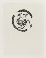 |
|
| |
|
|
|
V 19
|
Johann Caspar Lavater: Ueber die Animalistäts=Linien (Hundert physiognomische Regeln) 1802
Aus: Johann Kaspar Lavaters nachgelassene Schriften, 3.-5. Band in 1. Halbleinen mit Marmorpapierbezug. 20,4 x 13,4 cm. Herausgegeben von Georg Geßner. Zürich, bey Orell, Füßli und Compagnie, 1801-1802. Mit Bibliotheksstempel des katholischen Universitätsvereines Salzburg. 3. Band: Vermischte Gedichte, 368 S., 4. Band: Kanzelreden, 438 S. Der 5. Band mit 110 S. enthält die berühmt-berüchtigten „Hundert physiognomischen Regeln, mit vielen Kupfern“, wobei Nr. 100 ein eigenes Kapitel „Ueber die Animlitäts=Linien“ darstellt. Hier befinden sich im Anhang auch die 57 Kupfertafeln, die letzten drei als Ausfaltblätter, auf denen 12 Stufen vom Frosch zum Menschen und 24 Stufen vom Frosch zum Apoll dargestellt sind. Die originalen Vorzeichnungen dazu aus Lavaters Besitz befinden sich heute in der Österreichischen Nationalbibliothek in Wien, wo man auch um eine Einordnung bemüht war und zum Schluss kam: „In dem […] Text mit dem Titel „Ueber die Animalitäts-Linien“ bespricht [Lavater] den Winkel der Gesichtslinie ausführlich und nennt dazu auch seine Quelle. Anders aber als bei Camper ist der Gesichtswinkel für Lavater ein Maßstab für die Bewertung, der den Platz innerhalb der Hierarchie anzeigt: Manche Menschen und Völker standen nach seiner Ansicht ganz unten auf der Stufenleiter, bereits an der Grenze zum Animalischen.“ (Siehe: https://www.onb.ac.at/mehr/blogs/stufen-johann-caspar-lavaters-beitrag-zur-banalisierung-eines-naturgeschichtlichen-modells-der-vormoderne). Wir wissen wir nur zu gut, wohin diese Art des Denkens führt.
On the Lines of Animality (One Hundred Physiognomic Rules) 1802
From: The Posthumous Writings of Johann Kaspar Lavater, Volumes 3–5 in 1. Half linen with marbled paper cover. 20.4 x 13.4 cm. Edited by Georg Geßner. Zurich, published by Orell, Füßli and Compagnie, 1801–1802. With the library stamp of the Catholic University Association of Salzburg. Volume 3: Miscellaneous Poems, 368 pp., Volume 4: Sermons, 438 pp. Volume 5, comprising 110 pp., contains the infamous ‘One Hundred Physiognomic Rules, with numerous engravings’, with No. 100 constituting a separate chapter entitled ‘Ueber die Animalitäts-Linien (On the Lines of Animality)’. The appendix contains 57 engraved plates, the last three of which are fold-out sheets depicting 12 stages from frog to human and 24 stages from frog to Apollo. The original preparatory sketches for these, formerly in Lavater’s possession, are now in the Austrian National Library in Vienna, where efforts were made to classify them, leading to the conclusion: ‘In the […]
text with the title ‘On the Lines of Animality’, (Lavater) discusses the angle of the facial line in detail and cites his source. Unlike Camper, however, for Lavater the facial angle is a yardstick for assessment, indicating one’s place within the hierarchy: in his view, some people and ethnic groups stood at the very bottom of the ladder, on the very border with the animal realm. (See: https://www.onb.ac.at/mehr/blogs/stufen-johann-caspar-lavaters-beitrag-zur-banalisierung-eines-naturgeschichtlichen-modells-der-vormoderne). We know only too well where this sort of thinking leads.
|
300
|
| |
    |
| |
          |
|
|
|
|
Wo 1
|
Anonym: Steinmetzzeichen (Kunst- und Literaturblatt ) 1831
Kunst-Blatt / Literatur-Blatt: Je kompletter 12. Jahrgang 1831 mit je 132 Nummern, zusammen in 1 Band. 416 S., 528 S. Redigiert von Dr. Wolfgang Menzel. J. G. Cotta’sche Buchhandlung, Stuttgart und Tübingen 1831. Angebunden: 35 Nummern des „Intelligenz-Blattes“ 1831. Pappband mit Marmorpapierbezug und Rückenschildchen. 24 x 22,5 cm. Das Kunst-Blatt mit mehreren lithographischen Tafeln, teils zum Ausfalten. Die Nr. 55 vom 12. Juli 1831 enthält den Artikel „Runensteine im Rezatkreise“, die sich schließlich als Steinmetzzeichen entpuppen sollten.
Stonemason's Marks (Art and Literature Journal) 1831
Art Journal / Literature Journal: Each complete 12th volume 1831, with 132 issues, altogether in 1 volume. 416 pp., 528 pp. Edited by Dr Wolfgang Menzel. J. G. Cotta’sche Buchhandlung, Stuttgart and Tübingen 1831. Bound together with 35 issues of the ‘Intelligenz-Blatt’ 1831. Paperback with marbled paper cover and label on spine. 24 x 22.5 cm. The *Kunst-Blatt* with several lithographic plates, some of which fold out. Issue No. 55 of 12 July 1831 contains the article ‘Rune Stones in the Rezat District’, which were ultimately revealed to be stonemason’s marks.
|
350
|
| |
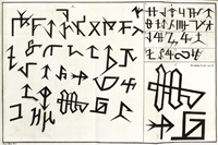 |
|
| |
|
|
|
Wo 2
|
(Karl Thylmann) J. W. Goethe: Urworte orphisch 1921
Or. dunkelgrauer Pappband mit Silberprägung, 26,5 x 22,2 cm. 16. S (nicht paginiert). Druck auf Büttenpapier. 3. Auflage, bei H. Hohmann, Darmstadt 1921. Mit 5 ganzseitigen ornamentalen Illustrationen von Karl Thylmann, die immer wieder als „Holzschnitte“ bezeichnet werden, bei denen es sich aber offenbar um Hochätzungen handelt. Die Stanzen Goethes entstanden bereits 1817.
Demonic Primal Words 1921
Original dark grey cardboard binding with silver embossing, 26.5 x 22.2 cm. 16 pp. (unpaginated). Printed on laid paper with a watermark. 3rd edition, published by H. Hohmann, Darmstadt 1921. With five full-page ornamental illustrations by Karl Thylmann, which are frequently referred to as ‘woodcuts’ but are in fact, it would appear, relief etchings. Goethe’s stanzas were written as early as 1817.
|
50
|
| |
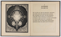  |
|
| |
|
|
|
Wo 3
|
(Karel Teige) Bratři Čapkové: Ze života hmyzu (Brüder Capek: Aus dem Leben der Insekten) 1924
Komödie in drei Akten mit einem Prolog und einem Epilog von Karel und Josef Čapek. Or.-Broschur mit Titelillustration von Karel Teige. 16,8 x 11,1 cm. 80 S. Unaufgeschnittenes Exemplar. Volksbibliothek Aventinum, Band 1. Verlag Ot. Štorch-Marien, Prag 1024. Referenz: Purvis/ de Jong S. 156
From the Life of Insects 1924
A comedy in three acts with a prologue and an epilogue by Karel and Josef Čapek. Original paperback with cover illustration by Karel Teige. 16.8 x 11.1 cm. 80 pp. Uncut copy. Aventinum People’s Library, Volume 1. Published by Ot. Štorch-Marien, Prague 1024. Reference: Purvis/ de Jong p. 156
|
70
|
| |
  |
|
| |
|
|
|
Wo 4
|
(Karel Teige) Konstantin Biebl: Zlom (Umbruch) 1928
Verlag Odeon, Prag 1928. 20 x 14 cm. 64 S., 2 Bl. Lagen teilweise lose, so wie veröffentlicht. Eines von 100 Exemplaren auf Van Gelder Bütten. Text in tschechischer Sprache. Umschlagentwurf, eine doppelseitige und 2 ganzseitige (diese auf gelbem Papier) typografische Kompositionen in zweifarbigem Buchdruck von Karel Teige zu den surrealistischen Gedichten von Konstantin Biebl. Die Typografien wurden offensichtlich nicht in allen Exemplaren auf dem gleichen Papier gedruckt. So ist zum Beispiel die doppelseitige Komposition beim Exemplar des Museum of Fine Arts Boston auf gelben Papier gedruckt, während diese in unserem Exemplar auf cremefarbigem Velinpapier gedruckt ist.
Teige, der sich in den Bereichen Bildende Kunst, Architektur, Film und Literatur engagierte, begründete in Tschechien den sogenannten "Poetismus". Er redigierte "Devětsil", eine der führenden Avantgardezeitschriften der Epoche, die für eine ganze Stilrichtung der tschechischen Moderne namenspendend wurde und hatte nach seiner Zuwendung zum Konstruktivismus 1929/30 eine Gastprofessur am Bauhaus in Dessau inne.
Zlom (Turning Point) 1928
Odeon Publishers, Prague 1928. 20 x 14 cm. 64 pp., 2 leaves, partly loose, as published. One of 100 copies printed on Van Gelder laid paper. Text in Czech. Cover design, a double-page spread and 2 full-page (the latter on yellow paper) typographic compositions in two-colour letterpress by Karel Teige accompanying the surrealist poems by Konstantin Biebl. The typographic compositions were evidently not printed on the same paper in all copies. For example, the double-page composition in the copy held by the Museum of Fine Arts, Boston, is printed on yellow paper, whilst in our copy it is printed on cream-coloured wove paper.
Teige, who was active in the fields of fine art, architecture, film and literature, founded the so-called ‘Poetism’ movement in the Czech Republic. He edited Devětsil, one of the leading avant-garde journals of the era, which gave its name to an entire stylistic movement within Czech modernism, and, following his turn towards Constructivism in 1929–30, held a visiting professorship at the Bauhaus in Dessau.
|
600
|
| |
 |
|
| |
      |
| |
|
|
|
Wo 5
|
(Karel Teige) Karel Schulz: SEVER ZÁPAD VÝCHOD JIH (Norden Westen Osten Süden) 1923
Verlag V. Vortel & R. Rejman, Prag 1923. 18,4 x 13,4 cm. 144 S. Umschlagentwurf von Karel Teige und Jaromír Krejcar. Unaufgeschnittenes Exemplar.
North, West, East, South 1923
Published by V. Vortel & R. Rejman, Prague 1923. 18.4 x 13.4 cm. 144 pp. Cover design by Karel Teige and Jaromír Krejcar. Uncut copy.
|
250
|
| |
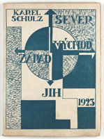 |
|
| |
|
|
|
Wo 6
|
(Eduardo Chillida) Aischylos: Die Perser 1978
Übertragen von Emil Staiger. Mit 4 (1 signiert und nummeriert) Orig.-Holzschnitten (inkl. 1 auf dem Umschlag) von Eduardo Chillida. 31,5 x 21,5 cm. 52 S., 2 Bl. Lose Lagen in illustriertem Orig.-Umschlag und schwarzen Leineneinband. 6. Druck der Edition Tiessen, Neu-Isenburg 1978. Eines von 150 arabisch nummerierten Exemplaren (Gesamtauflage: 170). Druckvermerk sowie ein Holzschnitt von Chillida signiert. Gedruckt auf handgeschöpftem Büttenpapier von Richard-de Bas. Mit dem lose beiliegenden Textheft "Anmerkungen und Nachwort".
The Persians 1978
Translated by Emil Staiger. With 4 (1 signed and numbered) original woodcuts (including 1 on the cover) by Eduardo Chillida. 31.5 x 21.5 cm. 52 pp., 2 leaves. Loose sheets in an illustrated original cover and black linen binding. 6th printing by Edition Tiessen, Neu-Isenburg 1978. One of 150 Arabic-numbered copies (total edition: 170). The colophon and one woodcut by Chillida are signed. Printed on handmade laid paper by Richard-de Bas. With the text booklet ‘Notes and Afterword’ enclosed separately.
|
3000
|
| |
      |
|
| |
|
|
| |
|
 |
| |
|
|
|